Dear Zamgra_Legacy,
We hope this message finds you well.
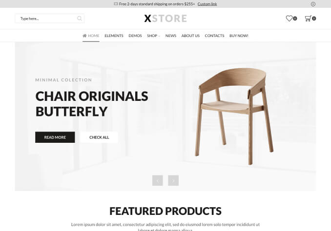
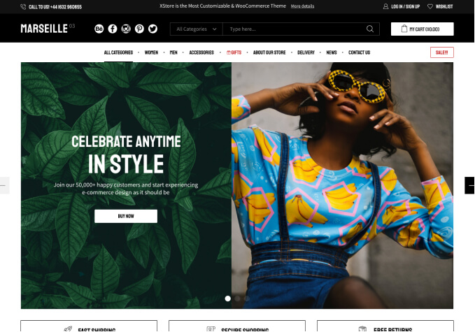
Could you please confirm if you are referring to the image display in your slider for mobile and tablet views as shown in the following link?
[https://prnt.sc/84mXKIOdKdwu](https://prnt.sc/84mXKIOdKdwu)
If this is the case, please note that the height of the images will be considerably reduced, which may impact the visual appeal on these devices. To achieve that, you can try with this custom CSS codes:
@media (max-width: 767px){
    .home .etheme-elementor-slides .swiper-slide-bg {
        background-size: contain !important;
    }
}
Thank you for your attention to this matter. We look forward to your confirmation.
Best regards,
The 8Theme Team

