Hello!
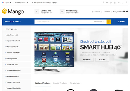
How can I change the number of columns how Product Categories look at mobile devise? And also font size on Product Categories labels for mobile version.
Thank you!
This topic has 2 replies, 2 voices, and was last updated 10 years ago ago by Robert Hall
Hello!
How can I change the number of columns how Product Categories look at mobile devise? And also font size on Product Categories labels for mobile version.
Thank you!
Hello,
1) To change them to one column at mobile device add this code in 8Theme Options->Styling->Custom CSS->Custom CSS for mobile.
.products-grid .product {
    width: 100%;
}
2) Please add the following code in 8Theme Options->Styling->Custom CSS->Custom CSS for mobile.
.product-category .categories-mask h4 {
    font-size: 15px;
}
.product-category .categories-mask span {
    font-size: 12px;
}
Regards,
Robert Hall
You must be logged in to reply to this topic.Log in/Sign up

