Hello, @levacare,
Phone Display:
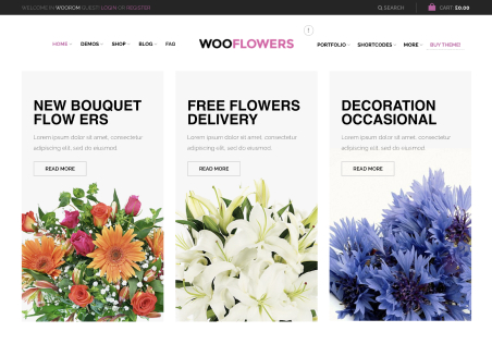
1- Actually, First of all, there is no such space in mobile to show all these three messages in the same line. Second, You created this section by using a row with three columns, and by default, only 1 column will appear on the site when viewing on mobile. This is the default layout.
2- You can set the space on the devices you want from the Elementor settings while editing the page check the image: https://postimg.cc/wtMHLPqZ
Ipad Display:
1- Again, As I said by choosing the specific device you want you can set the settings/spacing as per your need. Please check the image: https://postimg.cc/6yQNDgR3
2- There is only 1 possible solution left for this. I have disabled the section for tablet mode. Now, you have to create a new section there and show it only on the iPad. Hide the section from the mobile and desktop.
Regards 8Themes Team.

