Fix Color Issues in Your WordPress WooCommerce Templates Now
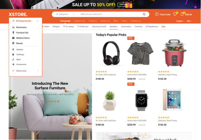
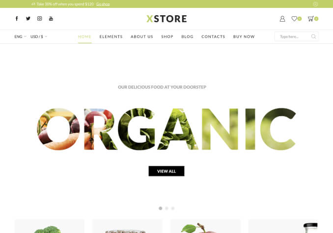
Color Issues in WordPress WooCommerce Templates When it comes to building and customizing WordPress WooCommerce Templates, one of the most common issues faced by developers is color issues. It can be incredibly frustrating to go through the process of designing a store only to realize that the color choices are not working out the way you envisioned. As you know, choosing the right color scheme for your store can be the difference between success and failure, so it’s important to understand the common color issues associated with WordPress WooCommerce Templates and how to fix them.
The first issue that arises is not understanding that the color of your store is extremely important. It’s not just about the aesthetics; colors are also used to convey a message. A study done by the University of Loyola Forum found that the main colors used in stores evoke different emotions and thoughts in customers. For example, blue is often associated with trust, reliability, and security, while yellow is associated with creativity. When choosing the colors for your store, it’s important to take these associations into consideration.
The second issue is not understanding how to use colors in a cohesive manner. When building and customizing a store, it’s important to understand the principles of color theory and how to use different colors to create a balanced and cohesive look. Too often, stores are built with an array of mismatched colors that confuse customers or give the wrong message. Taking the time to learn the basics of color theory can go a long way towards correcting this issue.
The third issue is not understanding the power of contrast. Colors don’t exist in a vacuum; they also work in relation to each other to create contrast. Contrast can be used to emphasize certain elements of your store and draw customers’ attention to them. Using contrast in color is a powerful tool that should not be overlooked.
Finally, understanding the difference between shades and tints is important. Different shades and tints of a color can evoke different emotions, so it’s important to use them correctly. While a light shade of blue can evoke feelings of trust and security, a darker shade can evoke feelings of mystery and intrigue. Taking the time to understand the different shades and tints can help make sure the color scheme of your store is conveying the right message.
In conclusion, understanding the common color issues associated with WordPress WooCommerce Templates can save you a lot of time and frustration. Although the color of your store is just one factor to consider when building and customizing a store, it’s an incredibly important one. If you take the time to understand the basics of color theory and how to use different colors in a cohesive manner, you can ensure that your store looks professional and conveys the right message.