How to stretch the homepage image slider row on mobile?

This topic has 8 replies, 3 voices, and was last updated 8 years, 9 months ago ago by Eva Kemp

  • Avatar: zulhfreelancer
    zulhfreelancer
    Participant
    August 3, 2015 at 15:26

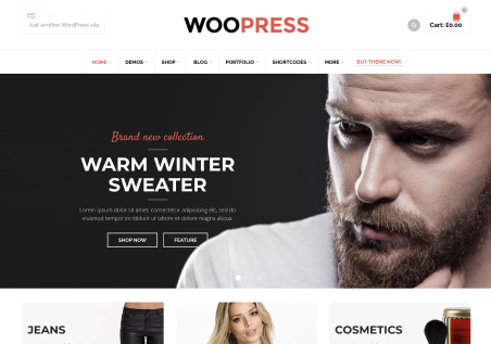
    This is the screenshot of my website. The image slider row stretched normally on desktop but it’s not stretched on mobile.

    And, the banner with mask also has left and right background color (black) on mobile.

    So,

    1. How to make the image row stretched too on mobile?
    2. How to remove the banner with mask black background color on mobile?

    Note:

    For the Revolution Slider’s row, I already set the setting to “Stretch row and content (no padding)”.

    Please, contact administrator
    for this information.
    7 Answers
    Avatar: Eva
    Eva Kemp
    Support staff
    August 3, 2015 at 16:11

    Hello,

    Please add this code in 8Theme Options > Typography > Custom CSS > Custom CSS for mobile:

    .banner.banner-type-6 img {
        width: 100% !important;
    }

    Regards,
    Eva Kemp.

    Avatar: zulhfreelancer
    zulhfreelancer
    Participant
    August 3, 2015 at 17:04

    How, it works. How about the image slider?

    Avatar: Robert Hall
    Robert Hall
    Support staff
    August 3, 2015 at 17:31

    Hello,

    Also try use this code in 8Theme Options > Typography > Custom CSS > Custom CSS for mobile:

    .vc_custom_1438467757535,
    .vc_custom_1438467783408,
    .vc_custom_1438467806640{
         padding-left: 0px; 
         padding-right: 0px;
    }

    Regards,
    Robert Hall.

    Avatar: zulhfreelancer
    zulhfreelancer
    Participant
    August 3, 2015 at 18:03

    That’s not what I mean. That CSS change my 3 banner image with mask width to 100%. That’s not what I wanted to.

    What I want is, make this slider width 100% on mobile.

    Not that 3 banner image with mask. Their width is already ok. I just want the slider row to be 100% width without left and right whitespace on mobile.

    Avatar: Robert Hall
    Robert Hall
    Support staff
    August 3, 2015 at 18:06

    Please try this code in 8Theme Options > Typography > Custom CSS > Custom CSS for mobile:

    .vc_row.vc_row-no-padding .wpb_column {
        padding-left: 0px;
        padding-right: 0px;
    }

    Regards,
    Robert Hall.

    Avatar: zulhfreelancer
    zulhfreelancer
    Participant
    August 3, 2015 at 18:15

    It works. Thanks!

    Avatar: Eva
    Eva Kemp
    Support staff
    August 3, 2015 at 18:53

    Hello,

    You’re welcome.

    Regards,
    Eva Kemp.

  • Viewing 8 results - 1 through 8 (of 8 total)

The issue related to '‘How to stretch the homepage image slider row on mobile?’' has been successfully resolved, and the topic is now closed for further responses

We're using our own and third-party cookies to improve your experience and our website. Keep on browsing to accept our cookie policy.