ok but you may want to put this in your documentation for future buyers or for roadmap to work on future updates – not our fault apple keeps making different devices with diff resolutions…your theme should be truly responsive.
Many thanks!
ok but you may want to put this in your documentation for future buyers or for roadmap to work on future updates – not our fault apple keeps making different devices with diff resolutions…your theme should be truly responsive.
Many thanks!
Nope didnt work…the ipad pro is taking the artwork from the desk top version not the ipad (mobile) version!
Please see login area.
Thanks!
Thank you! Didnt know you could change those!
Hi
Thank you!
I thought you were going to tell me what you did so i can copy it, can you fix it here (See private area) too please.
Thank you!
ok cool…but the problem i find with 2 menus is that two menus have underline at a time – it should be the ONE selected menu with an underline at a time – anyway around this?
hello, thanks!
Can i ask what you did please in case i have this problem again!
Thank you!
Thank you! Have no idea how that got disabled!
ok but how do i add it to the “watch advert” text?
pop up with video please, just like the demo….thanks!
erm…thats not working – i just want to add this link
https://twitter.com/i/status/1460025224909541379
to where it says watch video…how can i get this to work?
ok before i asked for your help…i have already tried all of what you have said…how do i copy the animation from a transparent background??? This is why …guess theres no way around it then. Thanks anyways. really hate rev slider sometimes – they have over complicated simple controls!
Thank you so much!
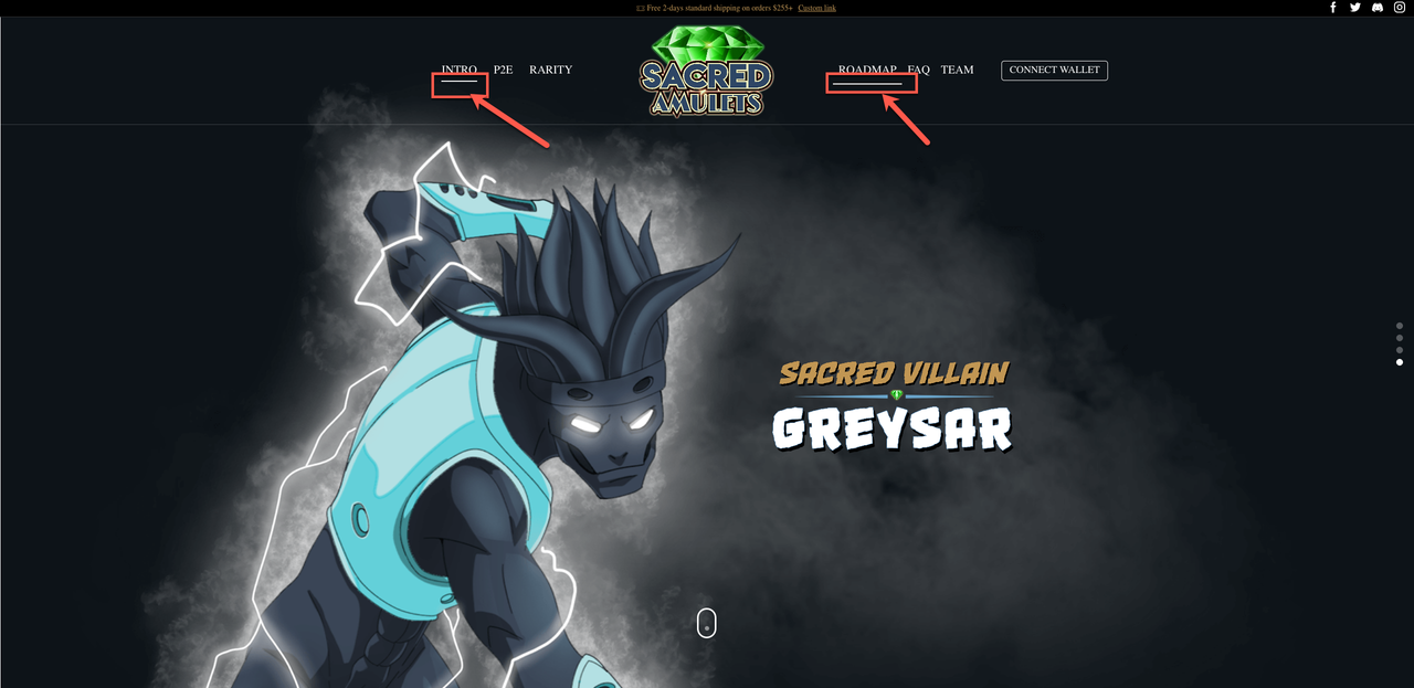
Sorry not sure what you mean and dont understand the screenshot!
Heere is a screen shot from my ipad:

I just need the header to be responsive please – i always get this with your theme when i build a new site – the ipad header is never correct!
Need an answer asap please!
Hi i have done the above – I spent ages getting it right and hit publised….but the published version is still not reflecting – still showing the demo version!
Is there something else i need to change???
Thank you!
Please see private area
Thank you!
Just read the blog – well thats stupid! Cant believe stripe would do this – seems a lot of people are not happy about it….i am wondering would it be possible to add credit card images next to the word credit card (stripe)???
How can i achieve this?
Thanks!
Thank you!
ok thank you! didnt know carousel slides are such a pain!
this is all fine – but for a CAROUSEL slide – it wont let me change the width!
Also i have other slides in there – if i change the global setting will the other slide setting change too?
I have played around with this so much it hurts!
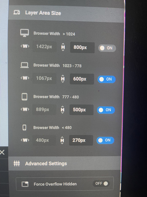
I have set the slide like this:
DESKTOP: 1422px x 800px
MOBILE (Ipad) 889px x 500px
Phone (Iphone) 480px x 270px
The problem is, the MOBILE (Ipad) 889px x 500px is USING the DESKTOP: 1422px x 800px – in the Ipad is showing the DESKTOP size i have set – NOT the Ipad size i have set!
I cannot get this to be responsive to the exact measurements above – this is where the issue is!
This is why i have to have 3 slides in the home page – which are all respectively hidden from each devices – depending on what the viewer is using to view the site!
Really dont know how else to explain it!
Hi i am going to close this as you are confused – this has NOTHING to do with the rev slider – I will open another topic with a different topic and show in the video whats happening!
Hi,
This is NOT a duplicate, this is about a oage NOT the rev slider – I named the other issue rendering1, this is rendering 2 – same issue but different content!
Thank you! No idea how or why i put that code there!
Hi thanks but there are so many issues to still deal with, but for now i will concetrate on the slide – each time i use the destop version slide for ipad it doesnt use the custom sizes i set – it just uses the desktop version hence why i had to create an ipad version – i can get the custom change to set for some reason, your video you sent is very outdated and i have googles about the slide and i just cant get it to work!
Here is my custom settings:
Im not sure ehy the slide is so heave as its mostly optmised images – i just cant get the ipad version to be set in the size i want!
Is there a way i can force the sizes i want for each devices – i find that either its greyed out or i cant choose a custom size for a carousel type slider!