The 'NO PRODUCTS WERE FOUND' message does not fit on a smaller screen.

This topic has 4 replies, 2 voices, and was last updated 7 years, 4 months ago ago by Olga Barlow

  • Avatar: Davey
    Davey
    Participant
    December 28, 2016 at 13:52

    Hello,

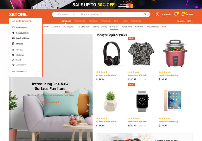
    I want the message NO PRODUCTS WERE FOUND to automatically transform to fit on a smaller screen, like a smartphone or a similar screen size.

    The CART IS EMPTY message automatically transforms to fit on a smaller screen. See the images to compare the differences what i’m trying to explain.

    http://imgur.com/MNfoLBk

    http://imgur.com/57xCThl

    3 Answers
    Avatar: Olga Barlow
    Olga Barlow
    Support staff
    December 28, 2016 at 15:56

    Hello,

    Hello,

    You are using third-party YITH plugin that has some additional class for the shop page structure and it makes the problem. Add the following custom CSS (Theme Options > Styling > Custom CSS) to solve the issue
    @media only screen and (max-width:992px){
    .yit-wcan-container{
    -webkit-order: 2;
    -ms-flex-order: 2;
    order: 2;
    width: 100%;
    }
    }

    We’ll also make changes in our styles to avoid this issue in future.

    Regards

    Avatar: Davey
    Davey
    Participant
    December 28, 2016 at 17:02

    It works.

    Thank you!

    Avatar: Olga Barlow
    Olga Barlow
    Support staff
    December 29, 2016 at 16:52

    You are welcome!

    Regards

  • Viewing 4 results - 1 through 4 (of 4 total)

You must be logged in to reply to this topic.Log in/Sign up

We're using our own and third-party cookies to improve your experience and our website. Keep on browsing to accept our cookie policy.