This topic has 104 replies, 5 voices, and was last updated 8 years, 9 months ago ago by Eva Kemp
Hi Eva,
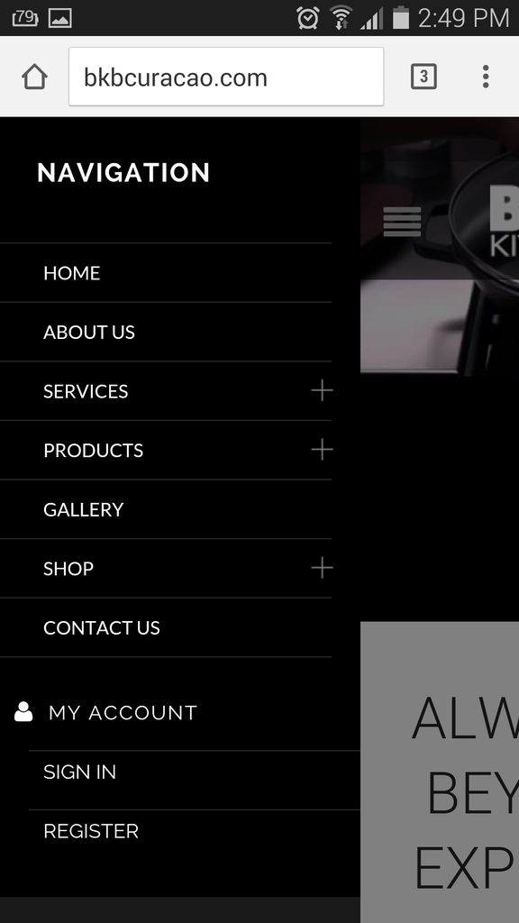
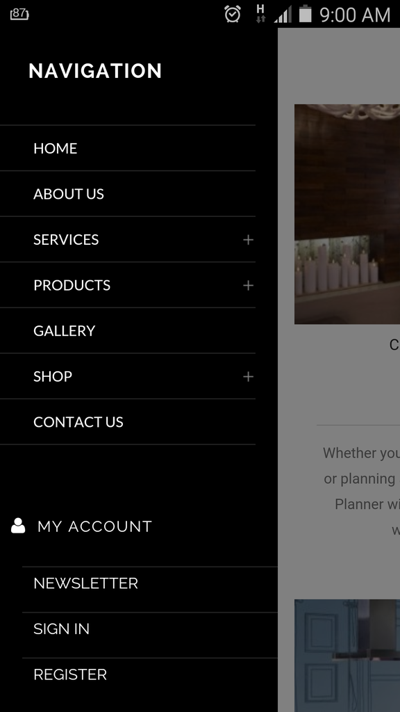
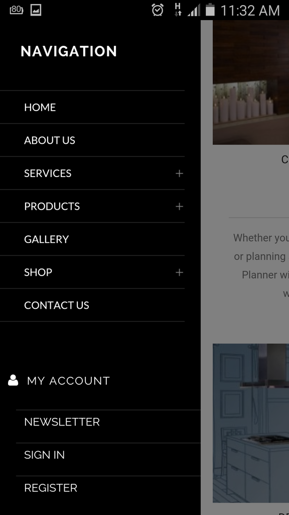
The menu looks fine now with the black color all over. Now I have a different problem after applying the code. Below the menu there is a grey bar:
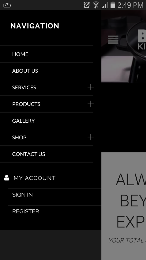
Also when exit the menu and scrolling I get this :
Can you check this part?
Hello,
Please add this code in custom.css file:
.st-menu-open .mobile-menu-block > .mobile-menu-block.st-menu {
    background-color: black !important;
}
I closed the menu and didn’t see any issues on the site. Are you checking home page? Do you mean the content is cut when you close mobile menu?
Regards,
Eva Kemp.
Good Day,
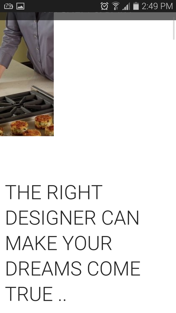
I have a problem when sliding the picture on my mobile the picture split and shows as follow:
Can you please correct this issue?
Hello,
I’ve checked your site and haven’t see any issues, see the screenshot
http://storage4.static.itmages.com/i/15/0720/h_1437411827_8343896_aafc2eb2d2.png
Please try to check it with other Internet provider.
Best regards,
Jack Richardson.
Good Day Jack,
We never spoke before but nice to meet you. I have been testing the Royal Theme for some time already. The issue addressed above I am experiencing on different ISP providers and also on my and partner mobile. Both Samsung latest browser updatesand OS. So this is something you will have to look into it. Normally Eva would check this and fix right away. If you see all the history of this ticket it all relates to changes etc.. You may also check my other tickets which you can notice that Eva is the one who helps with these. Please check one more with Eva or internally for this issue. This is not something of mobile or browser or internet!
Hello,
I checked your site and didn’t see any issues with the slider too. Please view the screenshot:
http://storage4.static.itmages.com/i/15/0721/h_1437464136_8398205_2000553e11.png
Could you please check it in another browser?
Does it persist on all mobile devices?
Regards,
Eva Kemp.
Hi Eva,
I checked this on IE and Google Chrome it shows the same. I’m using Samsung Galaxy S5 and Apple 4th Gener.. Safari browser. It shows on both that the problem is there ..
Good Day Eva,
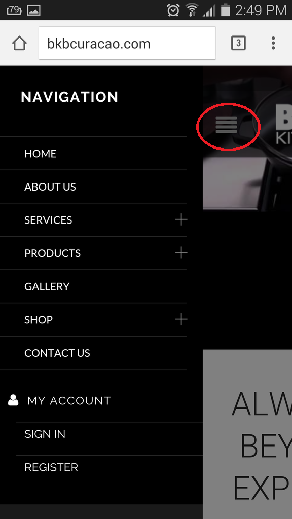
Which code do I need to use to change the icon in colored red below? Or which file to put a copy in our child theme folder and include which code?
Please let me know..
Hello,
Please use this code in child style.css:
.menu-icon::before {
   color: red !important;
}
Regards,
Eva Kemp.
Thanks Eva. Is there a code also to let me change the icon to a different icon?
Hello,
Yes, you can change the icon using this code:
.menu-icon::before {
 content: "code_for_your_icon or path_to_image" !important;
}
Best regards,
Jack Richardson.
Thanks Jack. Normally which code can be use for this? For example is it a font awesome code or a different code that is used for the existing icon? Or maybe can direct me to a website where I see all the poasible codes/icons which can used?
Hello,
For example, the code mobile menu icon is:
.menu-icon:before {
  content: "\f039";
  font-size: 26px;
  color: #a5a5a5;
  font-family: FontAwesome;
}
You can change the code \f039 for other icon. The icons can be found at this link:
http://fontawesome.bootstrapcheatsheets.com/
Best regards,
Jack Richardson.
Thanks Jack.
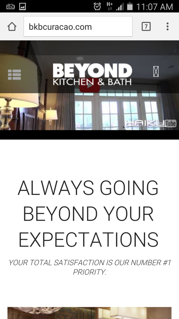
I have another question .. how do I stretch the video image to show without the black bars on the Mobile/Tablet? Currently when open the website on a mobile or tablet I see the black bars under the video which we would like for the video to show completely and that the clients can have the option to click on the Youtube icon to Play the video.
Thanks Jack.
I have another question .. how do I stretch the video image to show without the black bars on the Mobile/Tablet? Currently when open the website on a mobile or tablet I see the black bars under the video which we would like for the video to show completely and that the clients can have the option to click on the Youtube icon to Play the video.
Also I tried to add and (clear browser cache) the code to style.css but still the menu icon does not change. I’ve add the following into the style.css:
.menu-icon::before {
content: “.menu-icon:before {
content: “.fa-bars”;
font-size: 26px;
color: #a5a5a5;
font-family: FontAwesome;
}” !important;
}
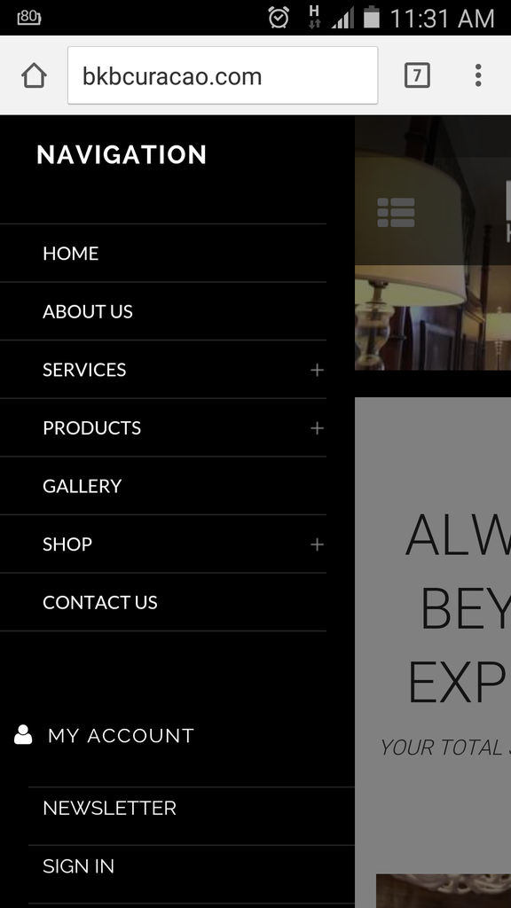
Ok .. so I manage to change the icon but when clicking on it does not show anything to illustrate how to close or go back from the menu to home page:
Can there be something which illustrates like a button to click to close the menu?
Also I am pending on the question below:
I have another question .. how do I stretch the video image to show without the black bars on the Mobile/Tablet? Currently when open the website on a mobile or tablet I see the black bars under the video which we would like for the video to show completely and that the clients can have the option to click on the Youtube icon to Play the video.
Hello,
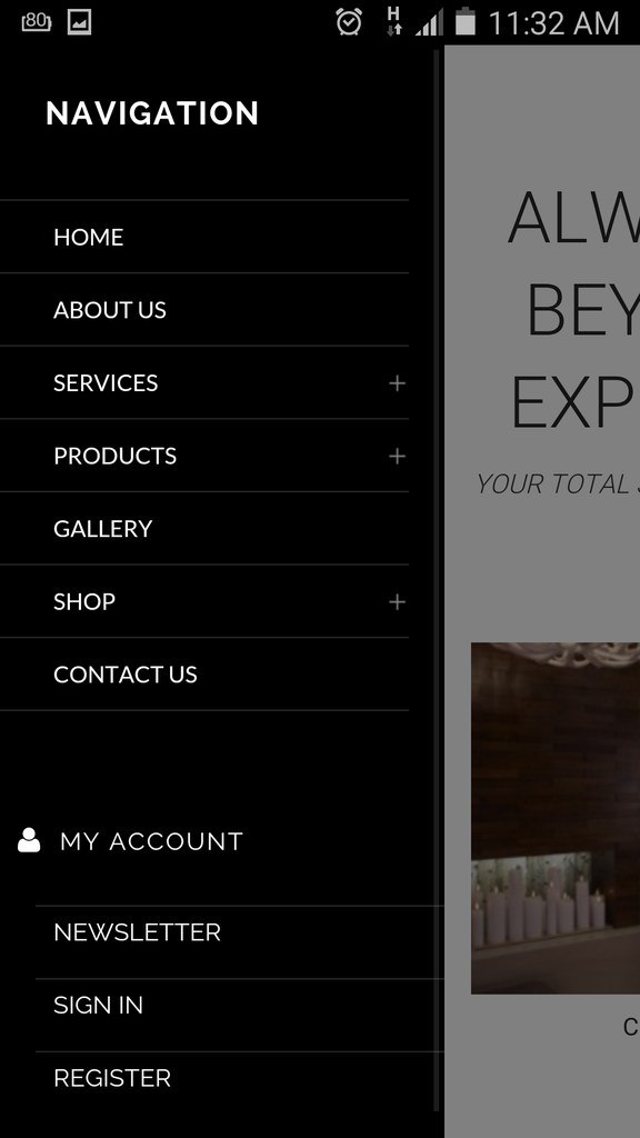
As I see the icon is shown to close mobile menu:
http://storage2.static.itmages.com/i/15/0722/h_1437576862_3141280_ba1e4dc4e2.png
Regarding the video please add this code in child style.css:
@media (max-width: 480px) {.page-heading-slider .wpb_revslider_element {
  height: 199px !important;
}}
Best regards,
Jack Richardson.
Hi Jack,
The code works indeed as should. However we would not want to shorter the video Height but would like for the video to show in the space fully cover without showing the black bars. Is this possible?
Hi Jack,
The code works indeed as should. However we would not want to shorter the video Height but would like for the video to show in the space fully cover without showing the black bars. Is this possible?
Also the Menu Icon does show when you click and when the menu is open. However the problem is when you scroll down and then click on the menu you dont see it again. Please check print screen shot below:
Please check and correct this.
Good Day,
Any update on this ticket?
Thanks..
You must be logged in to reply to this topic.Log in/Sign up


