Good Day Support,
I’ve noticed the following possible ” Bug ” when scrolling true the website on a mobile (Samsung Galaxy S5):
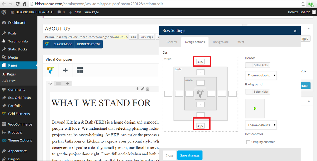
1.) It is noticed that when I turn the screen vertical or horizontal it is missing some text or not aligning the text as should in order to be visible on the screen (I’ve colored where I am pointing in color red):
http://i1340.photobucket.com/albums/o728/LibardoBarreto/xcvxcvxcv_zpsjiybpoc6.png
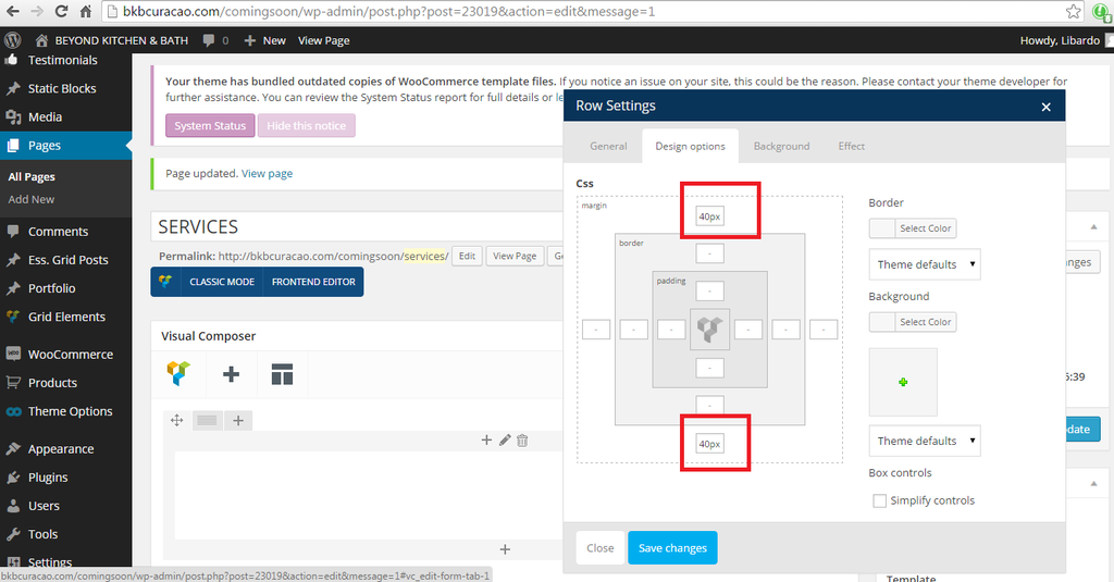
2.) Also when the phone is showing vertical it is showing the correct way but when I turn the phone horizontal it shows as follow:
http://i1340.photobucket.com/albums/o728/LibardoBarreto/34234_zpswfa0yyzf.png
Meaning the white bar (Where the logo is showing) needs to be black and also the language/currency field is showing again which was reported to be removed in ticket#52269


