Good Day Eva,
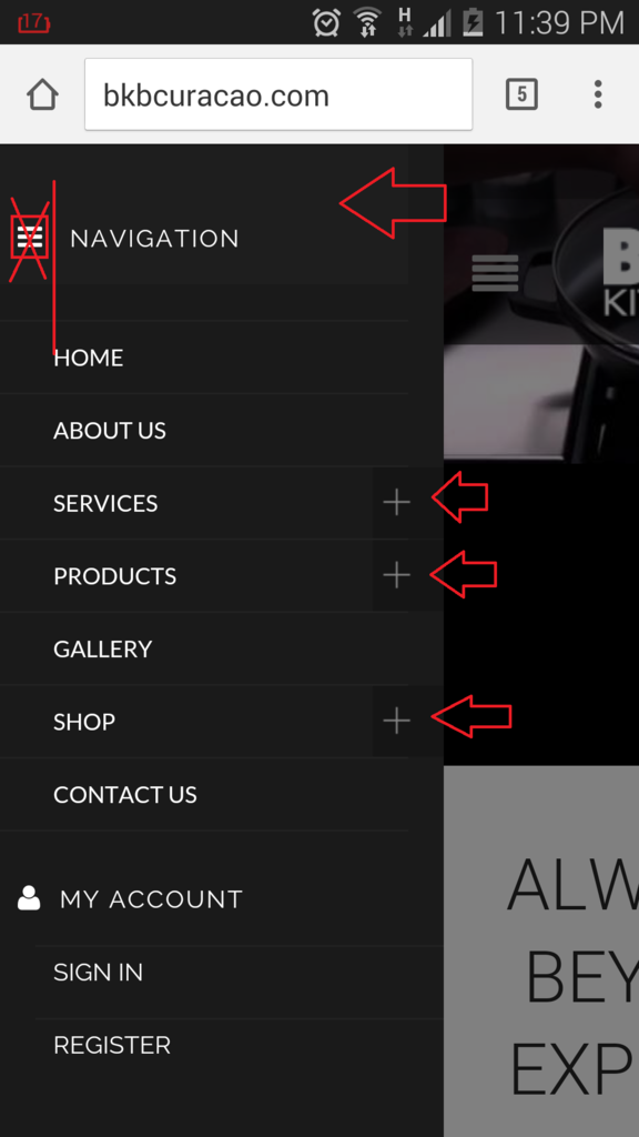
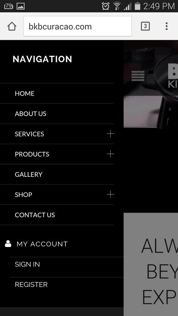
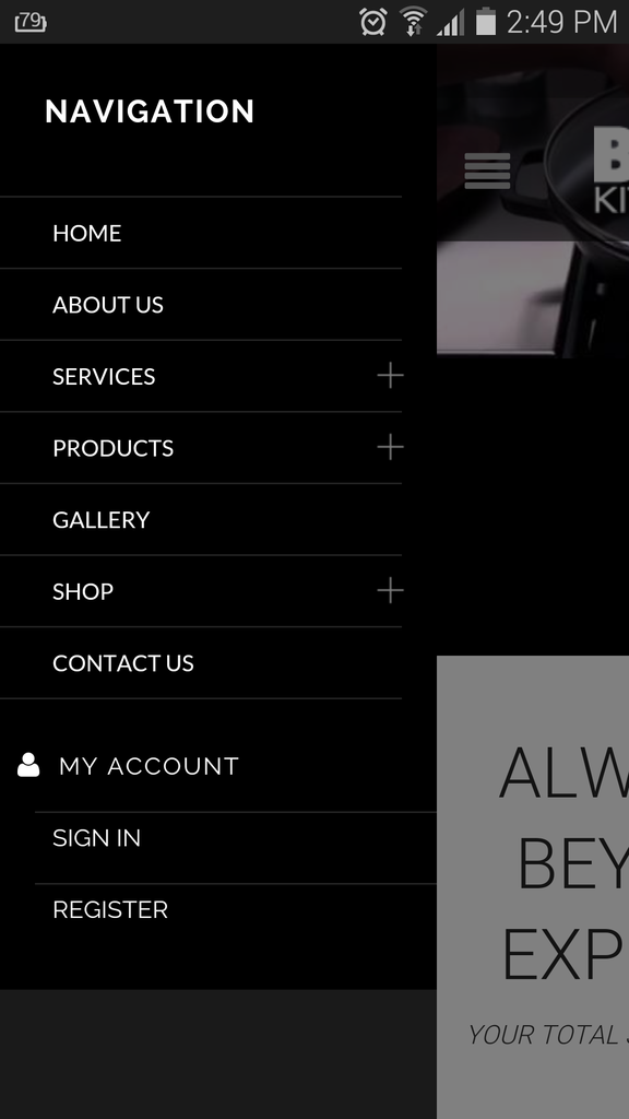
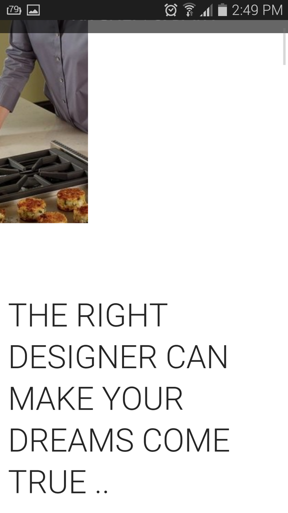
I noticed on our website the image is not showing as the cone of 8theme website. On our website is showing like this:
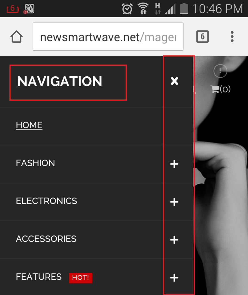
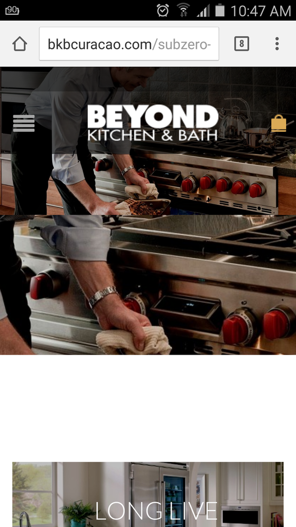
And on the 8theme website is showing like this:
IS there a way to adapt mobile and tablet to show as the 8theme website? You can see at the 8theme website is adapt as the Mobile version or Tablet version.
Let me know ..


