Thanks is there a something else which can min or max the break?
For example? <br -10>
Thanks is there a something else which can min or max the break?
For example? <br -10>
Hi Eva,
Thanks. Is it also possible to add additional fields requirements?
For example if I would like to request parts# can this be included for the http://www.bkbcuracao.com/services
And for http://www.bkbcuracao.com/contact-us the contact form will stay the same as is for now?
Thanks Eva.
Where do I find the captcha image for this one:
http://i1340.photobucket.com/albums/o728/LibardoBarreto/hgdfgdf_zpsfalbrwsr.png
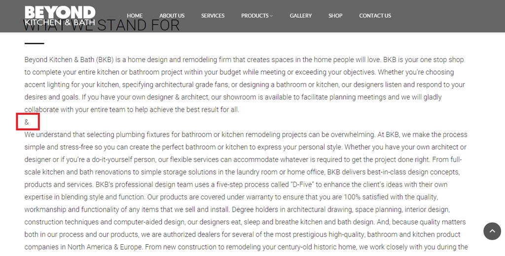
Good Day Eva,
Can you please assist why the break-spacing is not allowing?
I am using this code (&) at the moment were the & is showing in this picture below.
http://i1340.photobucket.com/albums/o728/LibardoBarreto/rwer_zpsguu8vjsy.png
The page is in private.
Hi Eva?
Thank You. The page for ITEM 1 is http://www.bkbcuracao.com/services
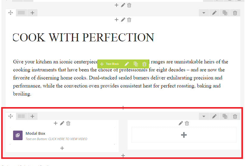
Hi Eva,
Can you assist me with the following:
ITEM 1
– Include Modal Box into the space where the arrow is pointing.IF not is there another option?
http://i1340.photobucket.com/albums/o728/LibardoBarreto/vcvxcv_zpsakw8xwvz.png
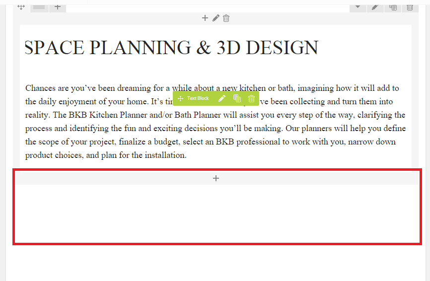
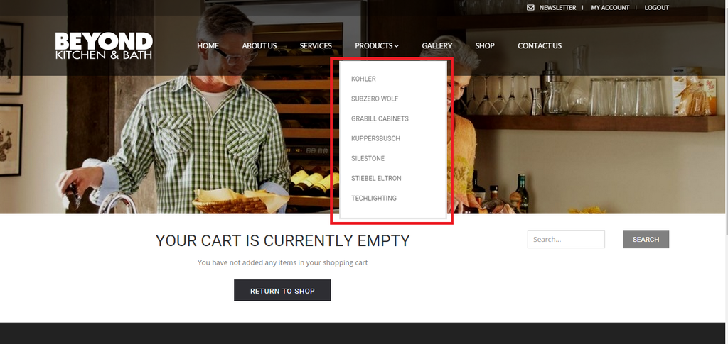
ITEM 2
– Can you include the MODAL BOX from the SUBZERO WOLF PAGE into the SERVICES page?
SUBZERO WOLF
http://i1340.photobucket.com/albums/o728/LibardoBarreto/gfgfdg_zpsewoyk026.png
SERVIES PAGE
http://i1340.photobucket.com/albums/o728/LibardoBarreto/ffdsfs_zpsmusctqq8.png
I tried to do this with the VC Editor and insert new Row but it wont show like the SUBZERO WOLF page. It is kind of embedded in two rows. I I use the words correctly..
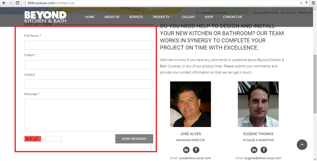
Hi Eva,
Would it be possible to use this contact form in a Modal Box (CUSTOM HTML)? IF so can you provide me with the code in order for me to create the Modal BOX and include the code to test it?
http://i1340.photobucket.com/albums/o728/LibardoBarreto/saadfgdsr_zpsi0wtcaag.png
http://i1340.photobucket.com/albums/o728/LibardoBarreto/tret_zpsexevaytn.png
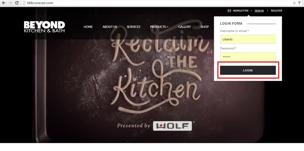
Hi Eva,
ITEM 1
– Could you change this RED image to the one below GOLD image as Register Form?
*** This one needs to be changed
http://i1340.photobucket.com/albums/o728/LibardoBarreto/hgdfgdf_zpsfalbrwsr.png
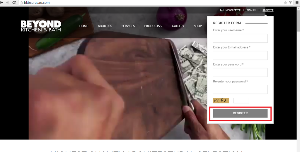
http://i1340.photobucket.com/albums/o728/LibardoBarreto/fdfsdf_zpsexj6hbme.png
ITEM 2
– Can you change the color of the button of SIGN IN to the One of REGISTER button? the color should be the lighter grey.
*** This one needs to be changed
http://i1340.photobucket.com/albums/o728/LibardoBarreto/gfdgfdg_zpsd4yny6xe.png
http://i1340.photobucket.com/albums/o728/LibardoBarreto/gfdg_zpsomye8atp.png
Hi Eva,
There seems to be a problem with the slider on the Mobile. Can you please check this and correct it for me?
http://i1340.photobucket.com/albums/o728/LibardoBarreto/fdd_zpspkjzzdvp.png
Thanks Eva.
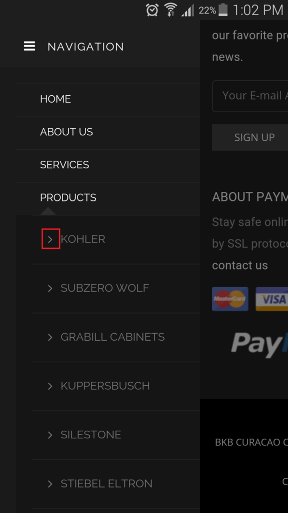
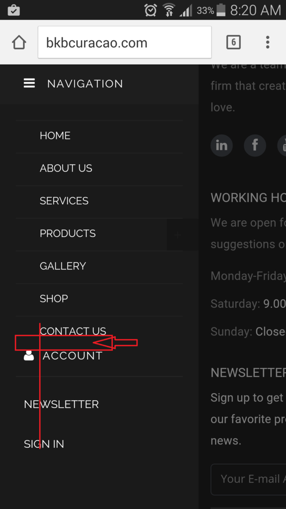
However Isn’t there a way to put MY ACCOUNT, REGISTER, SIGN IN, NEWS LETTER in the YELLOW box and the line in GREEN color below CONTACT US?
http://i1340.photobucket.com/albums/o728/LibardoBarreto/fdd_zpspkjzzdvp.png
Hi Eva,
– How do I change the color of this icon?
http://i1340.photobucket.com/albums/o728/LibardoBarreto/fgsds_zps76qxygti.png
Hi Eva,
I am not sure if we are talking about the same. What I was referring to is this page:
http://www.bkbcuracao.com/shopbkb
This is also a normal page as the rest and I can see that I can edit it as the others. However for some reason I cannot add these CSS block in the VC editor. Or is the SHOP page separately then the others? For me it would be difficult to know or see where to include the list of all the CSS codes in the Appearance > Editor. Is there a easiest way?
I would like to make the Header menu Fonts the same as the other pages. Also the transparent look for SHOP page for the header style is not showing as should.
Can you check these?
Hi Eva,
Thanks. It looks good. Can you do it also for Register button?
I also follow the link but could not found the Membership menu
=========================================================================
First of all allow the registration. Navigate to Settings > General > Membership and mark Anyone can register. Then create Register Page and set the page template (under page attributes) to Custom Registration Page.
=========================================================================
Or is it possible to create this for me?
Also how would I change the color of the Sign In / Register when I hover my mouse over these buttons? for example if I would like to change it to red instead of the black or grey color it turn into right now.
Hi Eva,
If you login you can see all the changes in the CSS block ( Appearance > Editor. ).
http://i1340.photobucket.com/albums/o728/LibardoBarreto/ffg4_zps6axaewm4.png
But none of these changes are reflecting on the page. Also the header menu/style is not showing as when you enter for example ABOUT US page.
Please kindly check.
Hi Eva,
Thanks.
For ITEM 2 + 3 it looks good. I have remove the codes and looks good as should. Now I only wanted to know if it is possible to put a stop action when click on Sign In, Register? Meaning right now when I click on one of them it will just refresh the page. Is there a way to just don’t do no action? Like for example I click on Products menu it does not do nothing but when I hover my mouse on it it will show a drop down menu.
Hi Eva,
Thanks.
Is there a way to:
ITEM 5
– Set the Newsletter, Register, Sign In, Account infront of the red line?
http://i1340.photobucket.com/albums/o728/LibardoBarreto/fsdf_zpswioa4hvs.png
ITEM 6
– Is there a way to include a ” X ” next to the navigation?
ITEM 7
– Set the Newsletter, Register, Sign In, Account same spacing between the menus as the rest of the menus like ( HOME, ABOUT US etc..)?
http://i1340.photobucket.com/albums/o728/LibardoBarreto/fsdf_zpswioa4hvs.png
ITEM 8
– Can the word ” ACCOUNT” change into ” MY ACCOUNT “?
http://i1340.photobucket.com/albums/o728/LibardoBarreto/fsdf_zpswioa4hvs.png
ITEM 9
– Can you provide me with the small Plus sign.png which was used for this image below?
Hi Eva,
Is there a way to make this drop down menu a transparent way?
http://i1340.photobucket.com/albums/o728/LibardoBarreto/FG4_zpswn1hvlwj.png
Hi Eva,
Thanks.
Is there a way to make the slider a bit longer in width for Mobile? For desktop is showing Good.
Maybe need to change this via Revolution Slider settings? I just want to know before make the change. If possible ..
http://i1340.photobucket.com/albums/o728/LibardoBarreto/vdgsg_zpsmswh4656.png
Hi Eva,
I just checked on the mobile site and noticed that the my account and the newsletter and the register option looks very bad. IS there a way to:
ITEM 1
– Is there a way to make all the Menu text into this Letter type/font:
ITEM 2
– Is there a way to level all menu text the same height spacing between each other?
ITEM 3
– Is there a way to make the mobile menu like this :
ITEM 4
– Also I see for accounts there is character infront of it, is there a way to add one as well for newsletter, register ?
I am open for options as well to change the style of the menu. The dark menu and the dark bars around the menu is not to shavy ..
Please let me know
Muchas Gracias Eva. >> Spanish
Dank Je wel … 🙂 >> Dutch
Hopi Danki >> Papiamentu
Thank You 🙂 >> English
So how is the website looking so far? I would also like to get some comments from the Best 8theme Support!!!
Hi Eva,
That’s correct. However is there a way to time this? Or maybe make it faster?
Hi Eva,
Just wanted to add Only ITEM 1 is missing some support. The rest I have manage to correct these. 🙂 You teach me Good!
Good Day Eva,
IS there a way to link this logo to the http://www.bkbcuracao.com website? At the moment is pointing to http://www.bkbcuracao.com/gallery
I tried to look into the setting and also check online but couldnt get something yet…
http://i1340.photobucket.com/albums/o728/LibardoBarreto/rwetwt_zps0zi01wvl.png
Hi Brian,
I just update the browser to the latest version and still see the same video:
http://i1340.photobucket.com/albums/o728/LibardoBarreto/rwerwer_zpseubtyovh.png
I tried also in IE, GOOGLE CHROME, FIREFOX still see the same issue with the video. I clear also my cache and the history and the cookies.
Good Day Eva,
Here we go for the Mobile version:
ITEM 1)
At the moment when I view the website on the Mobile or Tablet I see that the SIGN UP button of the newsletter is almost pressing on the text below it. Can you set it the same spacing like it is between the newsletter form and the text above this?
ITEM 2)
On the homepage when I scroll down before I reach footer the text kind of go in the back of the footer. Can this be corrected?
ITEM 3)
Again on the Homepage there seems to be the same problem as ITEM 2. The text kind of go in the back of the footer. Can this be corrected?
Hi Eva,
The color and the text is looking good. Now is there a way to make the size of the spin bigger?
Is this code correct?
.fa-spin-10 {
color: #7F006E;
}
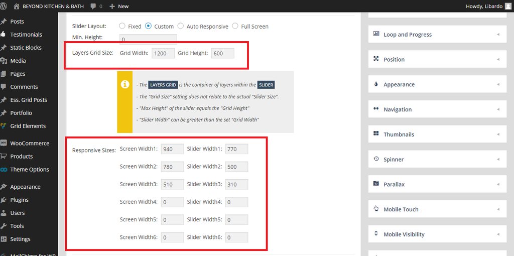
Hi Eva,
I’ve checked the document but do you know where I need to add this code? I tried to add in both CSS but nothing works :(:(
@media only screen and (max-width: 1800px) { .vimeoFrame .vimeoXtra { width:1200px; height:600px; margin-top:0;} }
Thanks Eva. Looks GOOD. However is there a way for the testimonials text to spin automatically?
Hi Brian,
From which browser are you trying this? I tried it with Google Chrome but still see the black bars after clearing cache and cookies
Hi Eva,
I’ve added this code but still the arrow shows.
.owl-controls {
display: none;
}
Also I’ve add this code but still there is a white arrow pointing down showing
.testimonial-info {
display: none;
}
Is there a way also to let the Testimonials spin automatically after a few seconds?
I;ve add the codes above in the Home Page


