Mobile Vs Desktop Website version - by Libardo

This topic has 10 replies, 2 voices, and was last updated 9 years, 1 months ago ago by Eva Kemp

  • Avatar: Libardo
    Libardo
    Participant
    March 24, 2015 at 21:13

    Good Day Support,

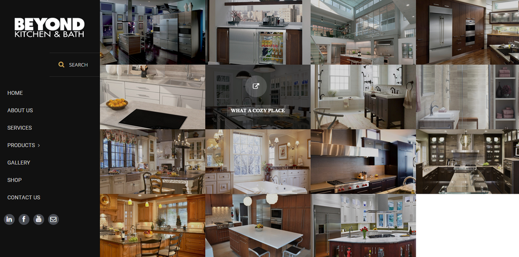
    I have a problem at the moment which when I go Online the website shows like this :

    bkbcuracao.com/gallery/

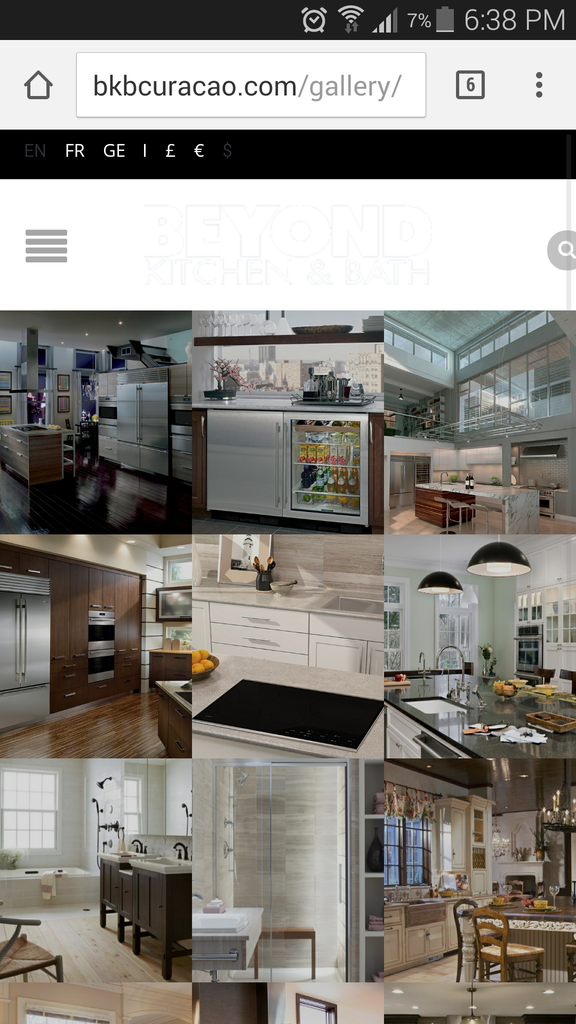
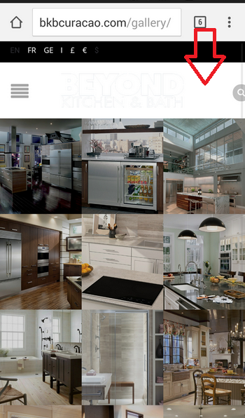
    However when I check on my mobile I see as follow:

    http://i1340.photobucket.com/albums/o728/LibardoBarreto/Screenshot_2015-03-23-18-38-38_zpswjc1hwxa.png

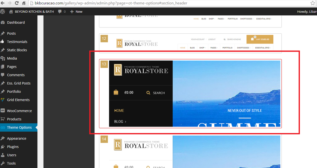
    The strange part that I dont understand is that I have the Header # 13 selected but #14 is showing on the mobile version. Can the Language and Currency from the top bar be removed?

    Please, contact administrator
    for this information.
    9 Answers
    Avatar: Eva
    Eva Kemp
    Support staff
    March 25, 2015 at 10:52

    Hello,

    Please add this code in custom.css file:

    @media (max-width: 480px) {.languages-area {
     display: none;
    }}

    Regards,
    Eva Kemp.

    Avatar: Libardo
    Libardo
    Participant
    March 25, 2015 at 11:44

    Thanks Eva. Do I need to do anything with respect to the Header #13 and #14 (Mobile)? Or the code above is for both request?

    Avatar: Eva
    Eva Kemp
    Support staff
    March 25, 2015 at 13:09

    Hello,

    Could you please clarify with more details concerning the headers issue?

    Thank you.
    Regards,
    Eva Kemp.

    Avatar: Libardo
    Libardo
    Participant
    March 25, 2015 at 13:25

    Hi Eva,

    As mentioned above when I open the website on a smart phone (In this case Apple Phone, Samsung Galaxy S5,) I get the following :

    http://i1340.photobucket.com/albums/o728/LibardoBarreto/Screenshot_2015-03-23-18-38-38_zpswjc1hwxa.png

    However when I open the website on a desktop I get the following:

    http://i1340.photobucket.com/albums/o728/LibardoBarreto/cddf_zpswisdm5fs.png

    What I was referring to the Header Option is as follow:

    http://i1340.photobucket.com/albums/o728/LibardoBarreto/sdfsdf_zpspxele8qo.png

    What seems to be the problem which on the Desktop and the Mobile is showing two different Header settings?

    P.S This option does NOT work when I active it ( Notify me of follow-up replies via email ). No e-mails is being send to me for notification in case the ticket is updated.

    Avatar: Libardo
    Libardo
    Participant
    March 25, 2015 at 13:32

    I also added this code in the custom.css file and still showing the same.

    @media (max-width: 480px) {.languages-area {
    display: none;
    }}

    Please don’t forget to look at the request also above.

    Avatar: Eva
    Eva Kemp
    Support staff
    March 25, 2015 at 14:05

    Hello,

    Vertical header and standard desktop header isn’t shown on mobile. Mobile menu is used instead.
    I’ve edited the code. Now languages area isn’t shown.
    Please check.

    Regards,
    Eva Kemp.

    Avatar: Libardo
    Libardo
    Participant
    March 25, 2015 at 19:24

    Hello Eva,

    Thanks. Can you also show me how to make this white color into black color?

    http://i1340.photobucket.com/albums/o728/LibardoBarreto/sdfsdfsf_zps5tlxiguj.png

    Avatar: Libardo
    Libardo
    Participant
    March 25, 2015 at 19:26

    Hi Eva,

    Can you also check Brian with ticket #52262? He is unable to login meanwhile the rest of 8theme is able to login.

    Avatar: Eva
    Eva Kemp
    Support staff
    March 25, 2015 at 19:36

    Hello,

    Your logo image is white color and it can’t be changed with css code as it’s a picture, so we can only change background color for header. Add this code in custom.css file:

    @media (max-width: 480px) {header {
        background-color: black;
    }}

    Thank you.
    Regards,
    Eva Kemp.

  • Viewing 10 results - 1 through 10 (of 10 total)

You must be logged in to reply to this topic.Log in/Sign up

We're using our own and third-party cookies to improve your experience and our website. Keep on browsing to accept our cookie policy.