Hello,
I’ve changed height value in the settings for the slider “SUBZERO WOLF”.
Please check.
Thank you.
Regards,
Eva Kemp.
This topic has 104 replies, 5 voices, and was last updated 10 years, 8 months ago ago by Eva Kemp
Hello,
I’ve changed height value in the settings for the slider “SUBZERO WOLF”.
Please check.
Thank you.
Regards,
Eva Kemp.
Hi Eva,
Thanks. What can I do to also change it for the other pages? Is there any ” Arrow ” that can be included in the sliders that is pointing to bottom?
Hello,
Edit other sliders in wp-admin panel > Revolution Slider > select slider to edit and set Slider Layout to “Auto Responsive” and Grid Height to 600 or other value.
Regards,
Eva Kemp.
Thanks Eva. Is there any ” Arrow ” that can be included in the sliders that is pointing to bottom?
Hello,
Unfortunately there is no such option. You may also refer to Revolution Slider documentation.
Regards,
Eva Kemp.
Good Day Eva,
Here we go for the Mobile version:
ITEM 1)
At the moment when I view the website on the Mobile or Tablet I see that the SIGN UP button of the newsletter is almost pressing on the text below it. Can you set it the same spacing like it is between the newsletter form and the text above this?
ITEM 2)
On the homepage when I scroll down before I reach footer the text kind of go in the back of the footer. Can this be corrected?
ITEM 3)
Again on the Homepage there seems to be the same problem as ITEM 2. The text kind of go in the back of the footer. Can this be corrected?
Hi Eva,
Just wanted to add Only ITEM 1 is missing some support. The rest I have manage to correct these. 🙂 You teach me Good!
Hello,
Please add this code in custom.css file:
.footer-top-2 .mc4wp-form input[type="submit"] {
   margin-bottom: 30px !important;
}
Regards,
Eva Kemp.
Hi Eva,
Thanks.
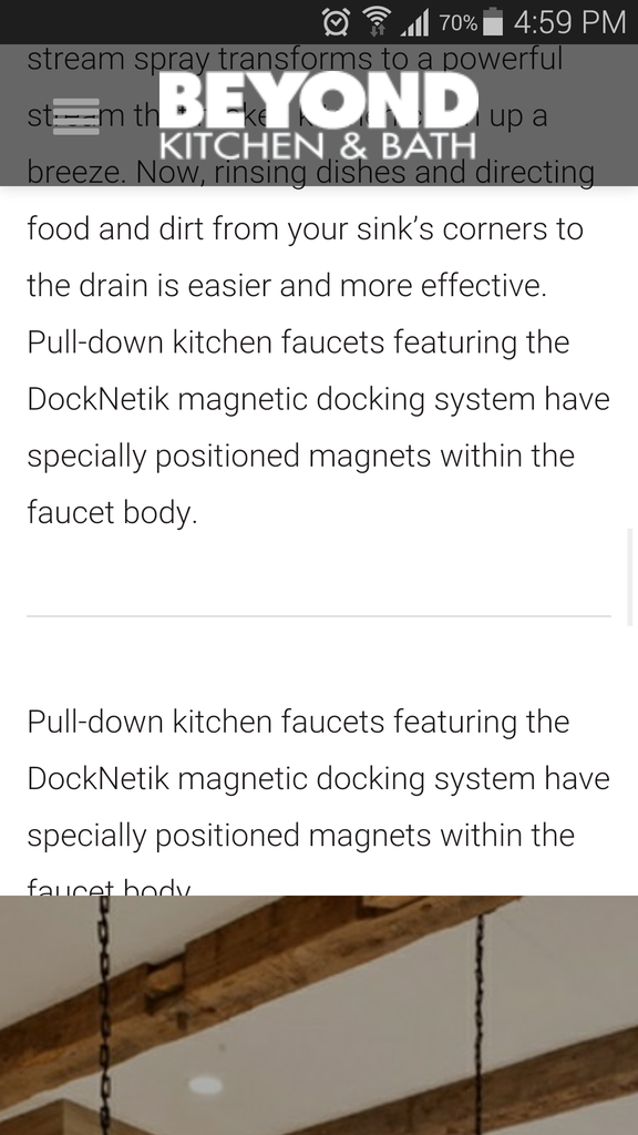
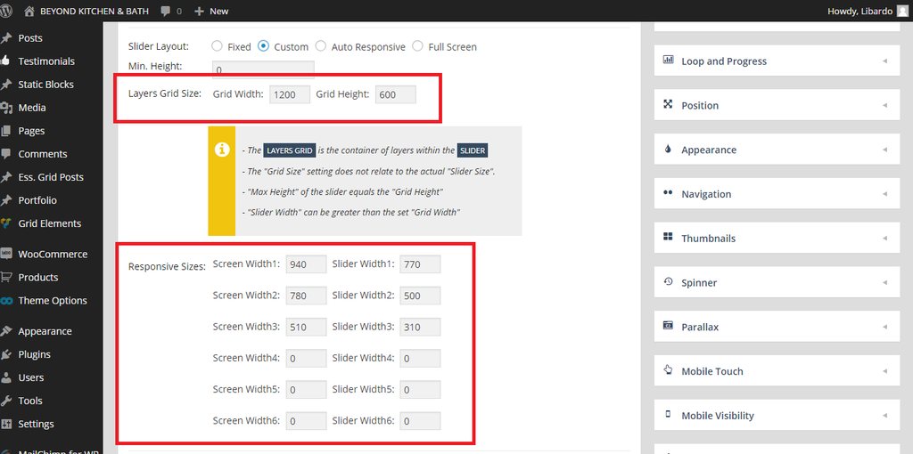
Is there a way to make the slider a bit longer in width for Mobile? For desktop is showing Good.
Maybe need to change this via Revolution Slider settings? I just want to know before make the change. If possible ..
http://i1340.photobucket.com/albums/o728/LibardoBarreto/vdgsg_zpsmswh4656.png
Hello,
Yes you can do this in slider settings using custom layout.
Regards,
Eva Kemp.
Hi Eva,
– How do I change the color of this icon?
http://i1340.photobucket.com/albums/o728/LibardoBarreto/fgsds_zps76qxygti.png
Hello,
You can use this code in custom.css file
.et-mobile-menu > li > ul > li a:before{
color:red;
}
Regards,
Robert Hall.
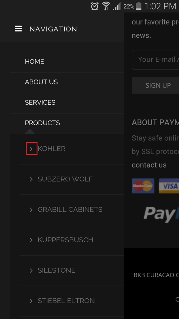
Hi Eva,
ITEM 1
– Is there a way for me to move the text to right,left,down,up?
http://i1340.photobucket.com/albums/o728/LibardoBarreto/ffe_zpsq8k6lgzo.png
ITEM 2
– Is there a way to have the spacing for the menus the same?
http://i1340.photobucket.com/albums/o728/LibardoBarreto/ffe_zpsq8k6lgzo.png
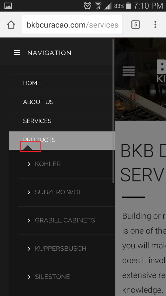
ITEM 3
– I also noticed when I click on the ” + ” sign to open this menu (PRODUCTS) upon close it will not close. Is there a way to add something like a ” – ” for a easy close? When I press on the image in color red it does not close again the menu.
http://i1340.photobucket.com/albums/o728/LibardoBarreto/ffs_zpso1giy8m7.png
Hello,
1. You can move 3 links “Newsletter”, “Sign In”, “Register” with this code in custom.css file:
.mobile-nav .links {
    margin-top: 20px !important;
    margin-left: 20px;
}
2. Use this code in custom.css file:
.mobile-nav .links {
  margin-top: -10px !important;
}
3. You need check your custom css code that you wrote for mobile menu.
Seems you made some mistake in the code.
Regards,
Eva Kemp.
For ITEM 2 works fine. For ITEM 1 I tried to set it as follow but nothing changed:
.mobile-nav .links {
margin-top: 80px !important;
margin-left: 20px;
}
For ITEM 3 I have included the codes that I have at the moment in CSS.
Hello,
Please specify where you want to move the links and which ones.
Thank you.
Regards,
Eva Kemp.
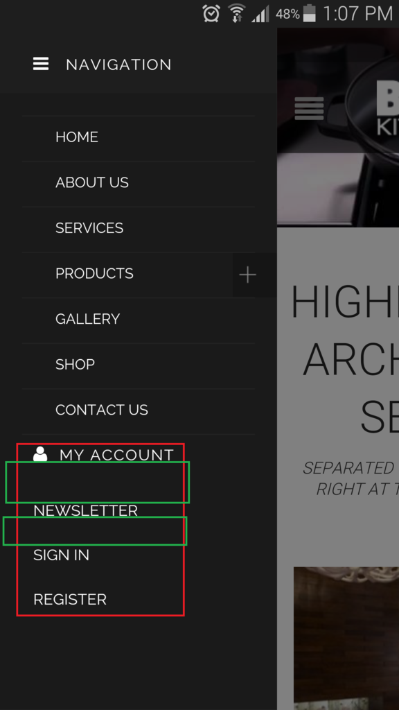
Hi Eva,
I would like to move “MY ACCOUNT” SIGN IN ” REGISTER ” NEWSLETTER ” a bit more down.
Also with respect to ITEM 3 I have included the CSS codes for you to check which of the codes are wrong which is causing for the Prdocuts Menu not to close upon clicking on it. Please check my earlier post befor this one. Can you check the code and indicate which one I will have to exclude or add?
Hello,
Please add this code in custom.css file:
.mobile-nav-heading i {
    margin-top: 50px !important;
}
I’ve edited the code for your mobile menu and changed class .et-mobile-menu to .mobile-nav which is used for the theme. Please check mobile menu now.
Regards,
Eva Kemp.
Hi Eva,
Thanks I will check this code. Additional:
ITEM 1:
I would like to know how can I control this part highlighted in red for mobile and tablet? I tried to do this in Revolution Slider Custom Menu or Fixed or Auto Responsive but I can get to have for mobile to drop the picture a bit below but for desktop to keep showing as it is at the moment.
ITEM 2:
Is there a way to have sort of page open as soon as a client open the website?
http://i1340.photobucket.com/albums/o728/LibardoBarreto/IMG-20150422-WA0004_zpsbveacfzk.jpg
Hello,
1. Do you want to set slider lower or to make its height bigger?
2. Sorry, there is no such feature.
Regards,
Eva Kemp.
Hi Eva,
I would like to make the Slider Heigt bigger for smartphones and for tablet. And for desktop would like to keep it as it is for the moment. When you have made the changes can you also provide the steps? Tl
Thanks..
Hello,
Please add this code in custom.css file:
@media (max-width: 480px) { .tp-fullwidth-forcer, .fullwidthbanner-container .fullwidthabanner  {
   height: 250px !important;
} }

@media (max-width: 978px) { .tp-bgimg.defaultimg, .tp-fullwidth-forcer { height: 400px !important;} }
Regards,
Eva Kemp.
Thanks Eva.
Can you please indicate which one of the codes will be for Desktop , smartphone and tablet?
Hello,
The 1st code is for smartphone and the second one is for tablets. Desktop view remain the same.
Regards,
Eva Kemp.
Perfect .. I will check them out
Hello,
You’re welcome.
Regards,
Eva Kemp.
Hi Eva,
I found some additional points to look into it:
ITEM 1.)
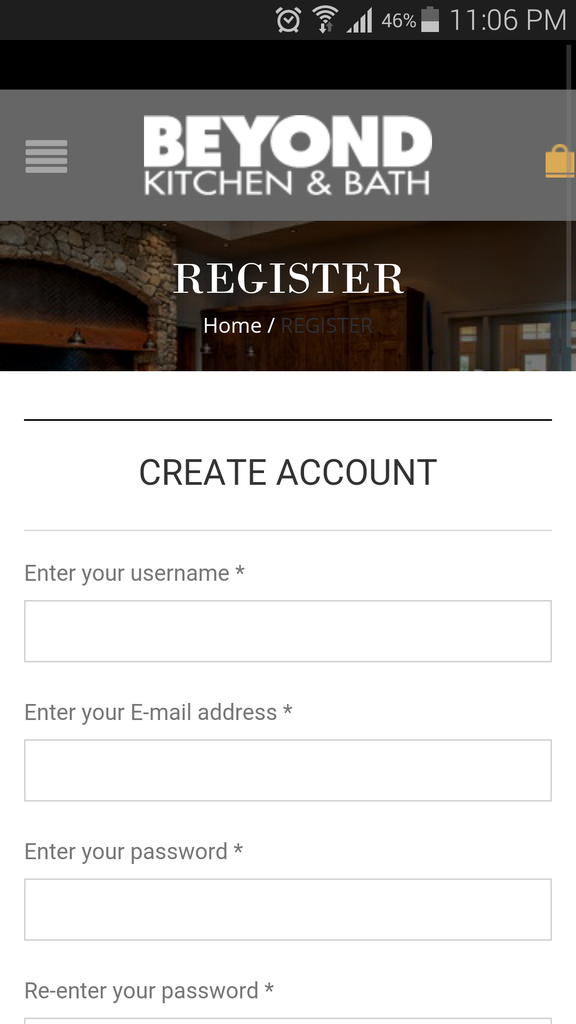
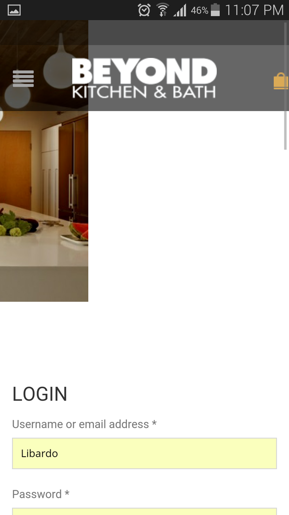
At the moment when I click on Register button which will take me to the Register page on the Mobile Version I noticed that it does not capture the header style as the My Account page. Also it seems to have text in the middle of the image which we would like for this to be removed. See below:
Register Page:
http://i1340.photobucket.com/albums/o728/LibardoBarreto/Screenshot_2015-05-12-23-06-07_zpsgse3y4i1.png
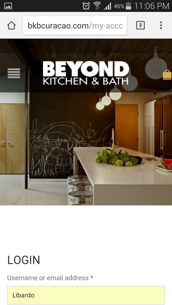
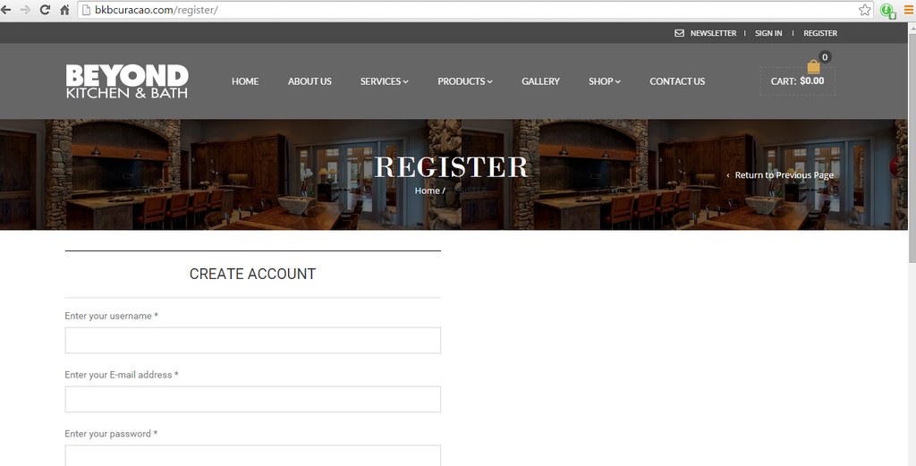
My Account Page:
http://i1340.photobucket.com/albums/o728/LibardoBarreto/Screenshot_2015-05-12-23-06-32_zpsarvytaxy.png
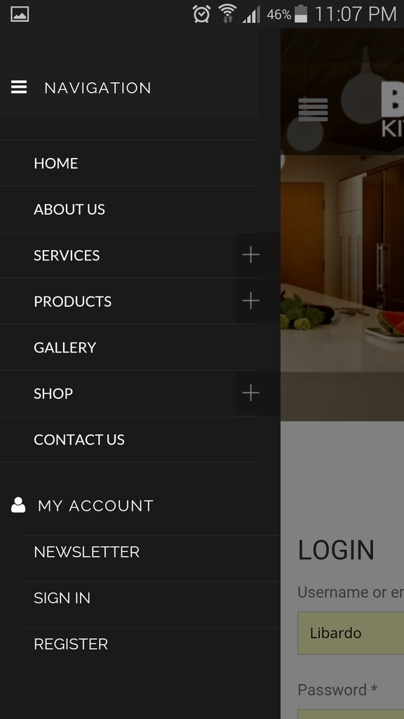
ITEM 2.) When I click on the open menu on the Mobile Version I get to see all the menus which I can have access to, however when I click on the revolution slider image next to the menu the screen does not adapt automatically back as it was before
Hello,
Register page uses our template and not Woocommerce.
If you want to have the same slider as on the “My Account” page you need add it to “Show revolution slider instead of breadcrumbs and page title” in Pages > edit Register page.
I’ve checked mobile menu and haven’t seen any issues with the slider.
Are you experiencing such issue on all mobile devices?
Regards,
Eva Kemp.
Hi Eva,
I’ve tried this already which is why I am asking how come the Revolution slider is not showing.
Right now is set to Revolution Slider but still showing like this:
http://i1340.photobucket.com/albums/o728/LibardoBarreto/REGISTER_zpsoq2gvwlm.png
I tried on Apple 6 and Samsung Galaxy s5 and got the same issue when clicking on the image next to the menu.
Hello,
I’ve edited et-registration.php file in wp-content/themes/royal directory.
Please check Register page now.
Regards,
Eva Kemp.
You must be logged in to reply to this topic.Log in/Sign up


