This topic has 69 replies, 5 voices, and was last updated 8 years, 7 months ago ago by Jack Richardson
Hello,
I’ve added this code in custom.css file:
.header-type-7 .header .navbar-header {
width: 90% !important;
}
Please check header now.
To translate theme you need follow the instruction in our documentation:
https://www.8theme.com/demo/docs/royal/#!/1_how_to_translate
Regards,
Eva Kemp.
I have short question,
On my Homepage the Footer Links and copyright dosent appear in Footer, when you go to shop or other page, you see Footer 2 and the Links + Copyright..
Hello,
You selected custom footer for home page. I’ve removed it and now similar footers are displayed on all pages.
If you want to show only one copyright section, remove your text block in Static Blocks > Footer 1.
Regards,
Eva Kemp.
i have to say thanks for that perfect support – rated 5 stars.
Ive translated everything but 2 things cant be? or where to change the Text ?
1. Returns& Delivery on Product page , where to change that and the Information of it?
2. Calculating the Shipping in the Cart, i want to translate the Text too
Hello,
You can find tab content in Theme Options > Single Product Page > Custom Tab title.
Please update the theme to the latest version and that message for shipping calculation will be removed in the new version.
Before update delete “woocommerce” folder in the directory wp-content/themes/royal/ and it’ll be reuploaded from a new theme package.
Also update all required plugins https://www.8theme.com/download-plugins/ .
Don’t forget to create back up of your files and database before starting update process!
(it’s for Legenda theme but the process is the same).
Regards,
Eva Kemp.
thanks for that.
on my shop i dont want product ratings “Bewertungen” , is it possible to deactivate this part and remove it from the page ?
Hello,
You can disable this option in Dashboard->Products->edit products->Product Data->Advanced.
Regards,
Robert Hall.
I have a last question, near everything is now perfect for me, but the header is in very bad quality ( resolution)
Its like beeing streched to fit in full widh , cant i upload a header on a fixed resolution ? Without streching and moving ?
What is the resolution for the Header part?
Hello,
The resolution is 1200px*150px.
Try to resize your image and reupload.
Best regards,
Jack Richardson.
i uploaded it in 1200x150px but as u can see in the screenshot it is resized badly…
it has to look like this
But its like this after uploading it..
Hello,
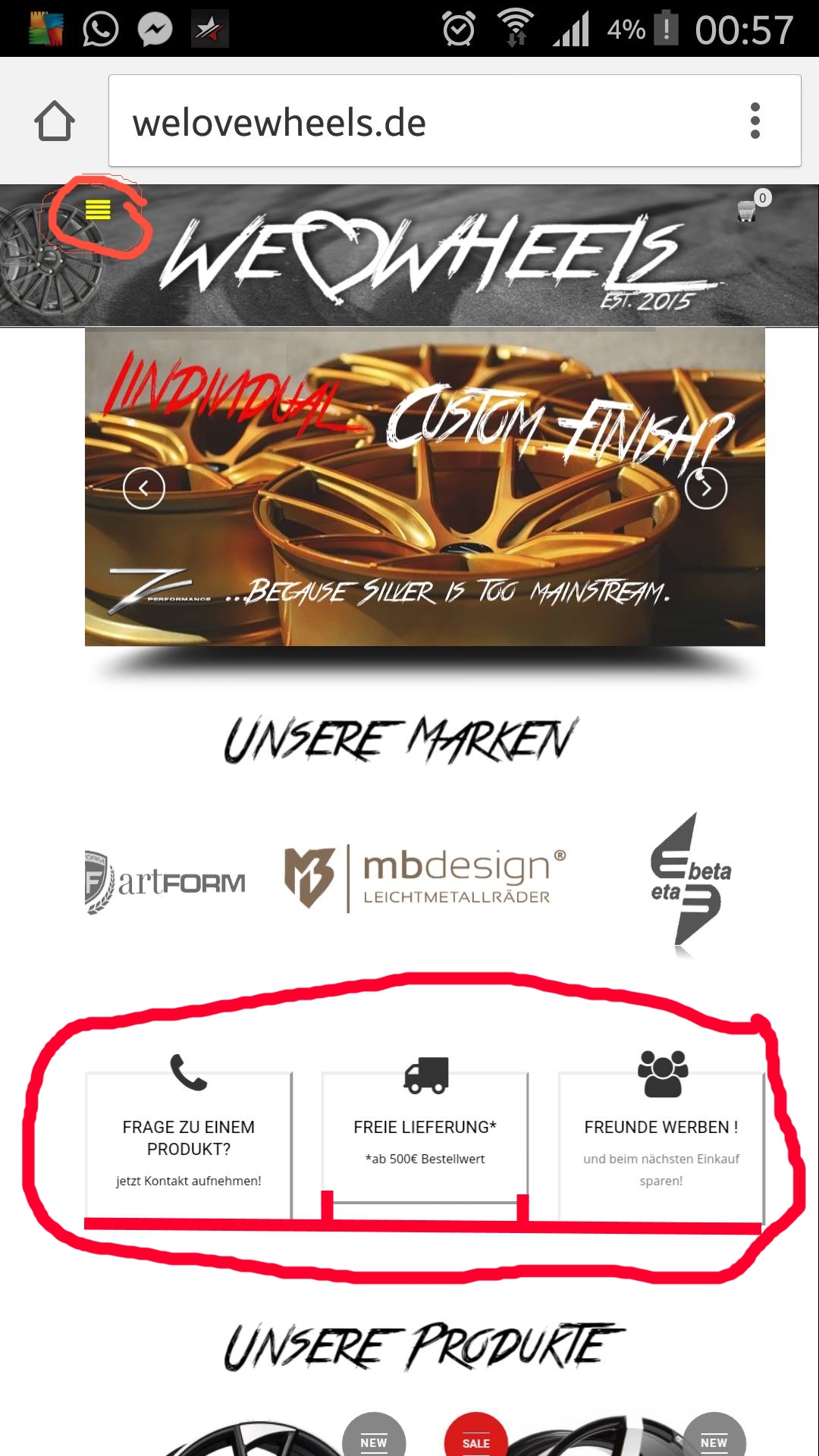
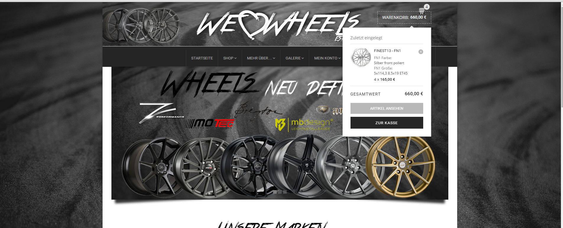
I’ve commented the code background-size: 100% 270px;
in custom.css file, so now it is:
.header {
background: transparent url("http://welovewheels.de/wp-content/uploads/2015/06/header1.jpg") no-repeat scroll top center;
/* background-size: 100% 270px;*/
}
Please clear browser cache and check your header now.
Regards,
Eva Kemp.
Hey i have 3 questions, how to put the social icos on the right side of the menu? i want to have them in space from the last menu category.
2. i want to make the mobile menu icon bigger to be more visible on smartphones, and the information boxes that marked in the screenshot, are displayed in a different size, on Destkop all 3 are the same.
3. if u visit my shop on smartphone, you cant select a category on the shop, and it is displayed over the products, which dosent look good.
All in all my side dosen`t look very mobile friendly, maybe you can help me.
Big thanks to ur service, support and helpful advices.
Hello,
1. You can try to use this code in custom.css:
li.menu-item-22050 {
margin-right: 400px;
}
2. Please use this code in custom.css:
@media (min-width: 768px) and (max-width: 1200px) {.square_box-icon .aio-icon-description {
height: 100px !important;
}}
.menu-icon:before {
font-size: 35px;
}
3. Please use this code:
@media (min-width: 768px) and (max-width: 1200px) {.content.main-products-loop.col-md-9 {
display: inline;
}}
Regards,
Eva Kemp.
Thanks for anwser, the second codes worked well.
But the first with placing the social icons to right side of menu bar and the thrid with the categorymenu on smartphones dosent change.
in point of the category menu on smart phones, maybe we can do it like a drop down menu?
Maybe u can try to fix it.
Hello,
1. Please give us access to wp-admin panel.
3. Try to use replace the code with this one:
@media (min-width: 480px) and (max-width: 1200px) {.content.main-products-loop.col-md-9 {
display: inline;
}}
Regards,
Eva Kemp.
Eva check private content
Hello,
I’ve edited the code and added this one in custom.css:
@media (min-width: 768px) and (max-width: 1200px) {.content.main-products-loop {
display: inline !important;
}}
@media (max-width: 480px) {.content.main-products-loop.col-md-9 {
display: inline !important;
}}
Please check the site on mobile devices now.
Also I’ve added this code custom.css for your menu:
li.menu-item-22050 {
margin-right: 200px;
}
li.menu-item-22052 {
margin-left: 240px;
}
Please check it.
Regards,
Eva Kemp.
Thanks so far, the category part dosent work at all….
but i have a bigger problem with the IOS Apple users! When they open my side they get an error after 1 secound and the browser try to re open it, it looks like its stuck on the revolution slider?
i deactivated the revolution slider on mobile, and it loads without a problem.
can u check if there is an error ? its realy important.
best regards.
Hello,
You need update the theme to the latest version.
Before update delete “woocommerce” folder in the directory wp-content/themes/royal/ and it’ll be reuploaded from a new theme package.
Also update all required plugins https://www.8theme.com/download-plugins/ .
Don’t forget to create back up of your files and database before starting update process!
(it’s for Legenda theme but the process is the same).
Regards,
Eva Kemp.
so i have to update all, but what is with my desgins oder slides that iam using? Isn`t everything deleted after replacing the folders into the new versions?
And with woocommerce also, do i loose them if i delete it from the theme directory?
Regards.
You must be logged in to reply to this topic.Log in/Sign up