Choose the Perfect Heading Color for Your WordPress WooCommerce Template
The importance of heading color in WooCommerce WordPress templates can not be understated. Heading color is an integral part of the design process, providing users with visual cues that help orient them and guide them through the digital experience. Without heading color, the page would become a jumbled mess and users would quickly become lost and confused.
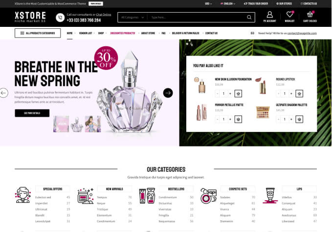
Heading color in WooCommerce WordPress Templates is used to convey hierarchy. Color helps users to determine what sections are most important on the page and what information is most relevant. For example, if you are looking for specific product information on a product page, major headings can be highlighted in a bolder, brighter color to draw the user’s attention.
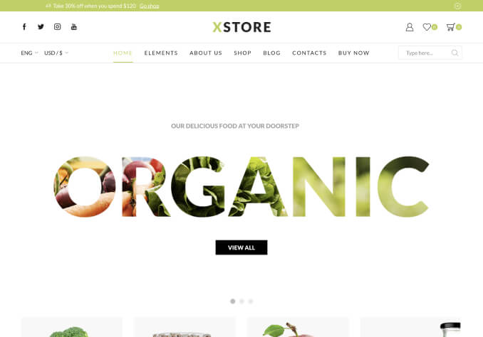
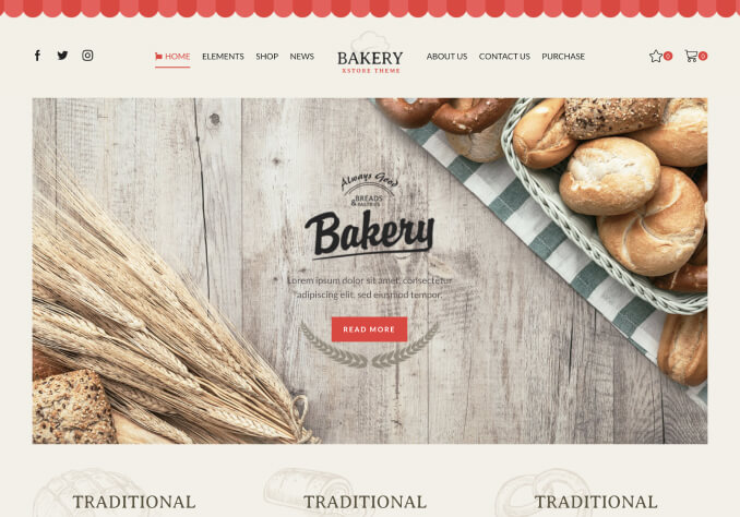
Heading color can also be used to make a page more visually appealing. By combining the right colors with font sizes and placements, heading color can help to create a more aesthetically pleasing look and feel. This can be a major boost in drawing in customers and potential shoppers, creating a more inviting atmosphere that encourages them to explore the page. Furthermore, the right combination of heading color can give a sense of brand identity, helping to differentiate your store from the competition and create a unique customer experience.
Heading colors must be well thought out and carefully chosen in order to be effective. A color that is too bright and garish can be overwhelming and distracting, while a color that is too dull and muted can be difficult to see. You should also keep in mind accessibility when choosing a heading color. It is important to make sure that the colors chosen are clear and legible for users with visual impairments.
Finally, heading color must be used consistently throughout the page. Keeping a consistent color scheme will help the user to quickly distinguish different sections of the page. Making sure to use heading color in a consistent way will make sure that your website is both functional and visually pleasing.
In conclusion, heading color in WooCommerce WordPress templates is a vital part of a successful design. It is essential to make sure that the colors chosen are clear, legible, and consistent. Choosing the right colors with the proper visual hierarchy can make a website more aesthetically pleasing and inviting, as well as creating a unique brand identity. Heading color in WooCommerce WordPress templates should not be overlooked in the design process.