How Responsive Designs Take a Tightening Grip Over the Market?
The concept of responsive design has become a trending topic on the web. And you can observe a continuous inclination towards designing responsive sites. That's because of the growing concern of web developers on making their site accessible across all modern devices as well as major browsers. And so, it won't be wrong to say that responsive designs have taken a tightening grip over the market.
Let's talk about some of the major reasons justifying the popularity and growing importance of responsive designs in the market:
Mobile Device Usage Has Skyrocketed
Mobile device usage is increasing, and everyone seems to be attached to their Smartphone or tablet. You can observe a continuous rise in the adoption of mobile devices by both consumers as well as business entities. While consumers are primarily using mobile devices to compare product prices and for purchasing the products, on the other hand, a lot of business persons are going mobile to expand their reach to the increasing number of mobile users. In fact, many users and companies are utilizing responsive WordPress themes to get their mobile site up and running in no time, without splurging huge amount of money.
Broaden Your Brand Reach and Increase Value
A majority of the population is relying more on mobile devices compared to desktops or PCs for Internet accessibility. And so, creating responsive web designs has become a mandate than just a fad for the web designers and business entities alike, to widen their brand reach. Moreover, nearly half of the B2B vendors nowadays prefer mobile to sell their products, and a lot more are planning on introducing mobile commerce features at the end of 2014. This will certainly help B2B vendors to increase their brand value.
Is Cost-effective
In today's BYOD era, the screen size and resolutions of devices keep on changing constantly. However, creating different mobile versions is financially implausible, and is also a time-consuming job. But designing a responsive design automatically adjust your site to fit the screen of the device you're using to access the web. And so, a responsive design proves to be a cost-effective choice, as you only need to create a single website layout that automatically fits to the device screen.
Good For SEO
We all know that the search engine giant – Google – favor searching for websites that are useful and contains relevant search-terms. When a user visits your site and immediately switch back to the SERPs, then Google considers your site as irrelevant for the search term that user typed in Google search pages. And not having a responsive website can have bad impact on your search engine ranking. Wondering how? According to a recent Google survey, it was found that 72% of mobile users look out for mobile-friendly sites. Therefore, make sure that your site features a responsive layout.
Boost Conversion Rates
A website offering consistent experience, irrespective of the platform it’s being accessed and viewed on, helps in providing an enhanced user experience. And so, having a well-designed and structured responsive site will enable a user to access your site across all the devices, which will more encourage them to engage with your website instead of going elsewhere increasing your site conversion rates.
Better User Experience
Designing responsive sites help provide a consistent user experience (UX) across mobile devices as well as desktops. A responsive design boasts a familiar design and consistently placed navigation across varied type of devices, which is easy to understand for the users. You don't have to bother about shrinking or re-sizing your website design, as the content of a responsive site automatically scales according to the device it is being viewed on. Just make sure to create a responsive design with a unified look and feel, while it performs the same functions across devices.
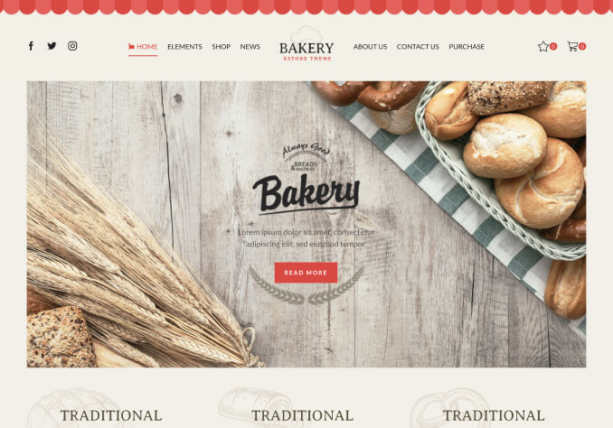
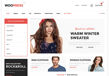
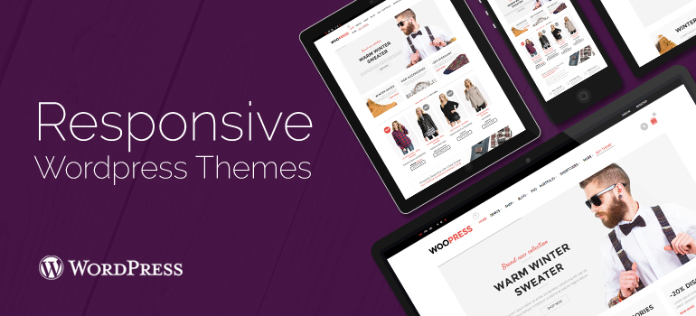
Remember that there's a lot more to responsive design than just creating a layout that adjusts automatically. You need designs that are flexible enough to scale according to upcoming new devices and browsers. What's more? Web designers as well as developers are exploring new areas of responsive design. And so, there's several exciting things you'll experience with a responsive design in the coming year, and the future of responsive design seems to be bright. Moreover, there are plenty of pre-built WordPress and WooCommerce themes, you can use to create your responsive site.
But if you still can't make out why you should move to a responsive design, then reading the aforementioned benefits of designing a responsive website will definitely help you clear out all your doubts.
Author Bio:
Victoria Brinsley is a veteran Android developer with Appsted Ltd – a reputed Android app development company. She can also assist you to explore more about this development platform and related technology.


