Hi Olga,
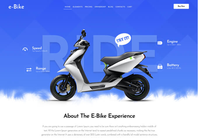
The screenshot in the PC is how we want our website to look on laptops.
One particular client who is designing our opening disclaimer has said:
“Regarding screen size, the header menu begins to wrap at a screen width of 1303px or less, all the way down to 991px width when the header menu switches to the mobile mode. So you have a full 312px gap of when the menu wraps before it switches to the mobile layout.
A simple solution would be to just switch to the mobile menu (hamburger icon) at the 1303px break point.”
Does this make any sense to you?
Kindest Regards, Su.
Hope that helps.