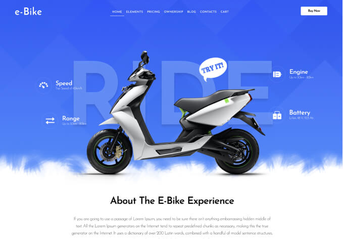
The two lower main photos on the homepage do not appear to be responsive when viewed on mobile devices.
The images are “smushed” and the size difference to the main image is thrown off. The two lower images become larger than the main image when on mobile. The main image is a layer slider and the 2 images below this are inserted into the home page.
We tried using the .containerInner img{height:auto;} but it didn’t have an effect. I was under the impression that all of the key files in the latest update were copied over but just in case I changed the name of the blanco theme with our edits and added the newest theme on the SFTP client and activated it – the images were still not responsive on mobile. Could it be something with the images? We just uploaded the correct dimension file side and inserted them to the homepage.
As an FYI we have reverted back to the previous theme in an effort to keep out code edits. The newest blanco theme is in the themes named blanco and the one with our edits and is currently active is blanco1.

