Hi,
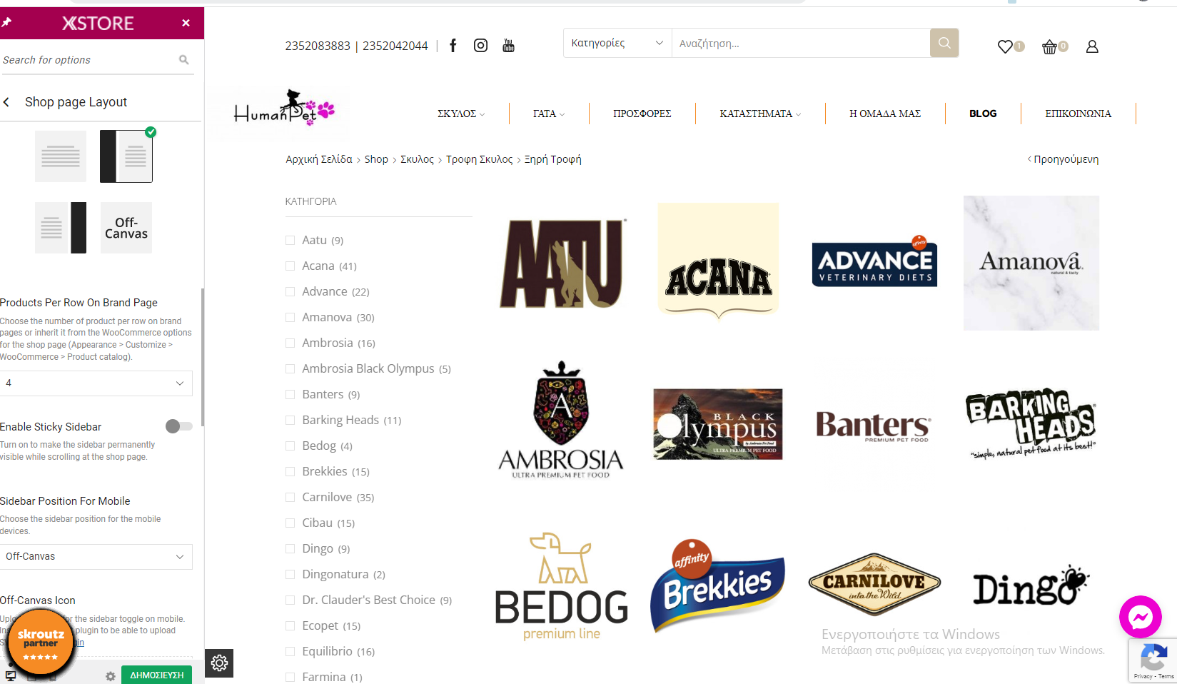
I want to ask how I can short categories on mobile view. I want to show 3 categories per row on mobile, except two like now on page https://humanpet.gr/product-category/skylos/trofi-skylos/ksiriskylos/.
https://humanpet.gr/wp-content/uploads/2022/05/2022-05-24-17_15_54-Window.png
https://humanpet.gr/wp-content/uploads/2022/05/2022-05-24-17_18_42-Window.png
Best regards,
Site URL: hidden Theme version: 4.1.6 WooCommerce version: 6.5.1Hello,
Add the next code in Theme Options > Theme custom CSS > Mobile:
.row-count-4 .product-category:nth-child(2n+1) {
clear: none !important;
}
.products-grid .product-category {
width: 33.33%!important;
}
.row-count-4 .product-category:nth-child(3n+1) {
clear: both !important;
}
Regards
Hi,
Thank you φορ the code, but I can’t find the path for mobile, I only find Custom CSS.
And when I enter this code, it fixes for mobiles, but it brakes for desktops. Is anything else, that you suggest doing?
Best regards,
The topic ‘Short categories on mobile view in my site’ is closed to new replies.
One standard license is valid only for 1 project. Running multiple projects on a single license is a copyright violation.