Menu fixed navigation and mobile navigation.

This topic has 11 replies, 2 voices, and was last updated 9 years, 2 months ago ago by Eva Kemp

  • Avatar: pro2know
    pro2know
    Participant
    January 13, 2015 at 04:05

    Hello,

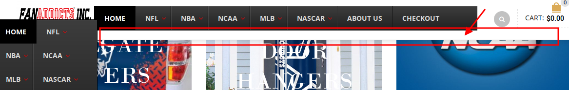
    I know that you are not responsible for ubermenu in any way but wanted to see if their is a way that I can make them play nice together. I had to use ubermenu because I putting team logos by every menu name and could not get your menu to cooperate. Everything is fine on the standard menu http://i1381.photobucket.com/albums/ah239/p2kwebdesign/mainmenu_zpsed2e20d3.png and fixed navigation http://i1381.photobucket.com/albums/ah239/p2kwebdesign/topmenu_zps581198e7.png except I would like to get rid of the extra dead space at the end of the fixed navigation which ubermenu says is being controlled by the royal theme. Then the cellular mobile menu http://i1381.photobucket.com/albums/ah239/p2kwebdesign/cellphone_zps8ec1675e.png is great but when you use a tablet it turns too this http://i1381.photobucket.com/albums/ah239/p2kwebdesign/tablet_zps4c646713.png where it stacks the items. Is there a way to keep the cellular menu when it is being looked at from a tablet?

    10 Answers
    Avatar: Eva
    Eva Kemp
    Support staff
    January 13, 2015 at 09:11

    Hello,

    Please provide us with a link to your site and wp-admin panel credentials to check the issue.

    Thank you.
    Regards,
    Eva Kemp.

    Avatar: pro2know
    pro2know
    Participant
    January 13, 2015 at 15:52

    I have put the work in progress site on my demo webpage listed below

    Please, contact administrator
    for this information.
    Avatar: Eva
    Eva Kemp
    Support staff
    January 13, 2015 at 18:25

    Hello,

    If you’re talking about this space, it can’t be removed as logo size doesn’t allow it. In order to hide it you need decrease the logo.

    Concerning your second question about the menu on tablets you have to contact the plugin author.
    Sorry for inconveniences.

    Regards,
    Eva Kemp.

    Avatar: pro2know
    pro2know
    Participant
    January 13, 2015 at 18:47

    Is there a way with your menu system to have the team logos next to the team like I have right now?

    Avatar: Eva
    Eva Kemp
    Support staff
    January 13, 2015 at 18:54

    Hello,

    You can only add an image as described in our documentation:
    https://www.8theme.com/demo/docs/royal/#!/primary_menu > 7.3 Menu images

    Thank you.
    Regards,
    Eva Kemp.

    Avatar: pro2know
    pro2know
    Participant
    January 14, 2015 at 13:43

    What code could I use to make the responsive menu not start until it reaches a 6.5″ or smaller device size. All it has is a toggle switch for responsive.

    Avatar: pro2know
    pro2know
    Participant
    January 14, 2015 at 14:22

    I would like the mobile menu to only take effect if the device is 414 x 736 or lower.

    Avatar: Eva
    Eva Kemp
    Support staff
    January 14, 2015 at 15:29

    Hello,

    You can try to edit the media query located in the responsive style sheet file wp-content/themes/royal/css/responsive.css (line 1005) and change max width value.

    Thank you.
    Regards,
    Eva Kemp.

    Avatar: pro2know
    pro2know
    Participant
    January 15, 2015 at 19:56

    Is there a way to hide fixed navigation when the resolution drops to the size of say an iPad?

    Avatar: Eva
    Eva Kemp
    Support staff
    January 15, 2015 at 21:38

    Hello,

    Please add this code in custom.css file:

    @media only screen and (max-width: 979px) and (min-width: 768px)
    .fixed-header-area {
    display: none !important;
    }

    Thank you.
    Regards,
    Eva Kemp.

  • Viewing 11 results - 1 through 11 (of 11 total)

You must be logged in to reply to this topic.Log in/Sign up

We're using our own and third-party cookies to improve your experience and our website. Keep on browsing to accept our cookie policy.