In mobile version how to keep add to cart button fixed in the down?

This topic has 4 replies, 3 voices, and was last updated 1 months ago ago by Luca Rossi

  • Avatar: sefat
    sefat
    Participant
    January 14, 2025 at 23:45

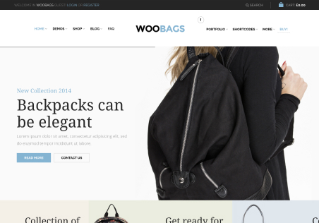
    How do we keep the add to cart button fixed on scrolling down in the mobile version?
    check the screenshot

    Files is visible for topic creator and
    support staff only.
    3 Answers
    Avatar: Tony Rodriguez
    Tony Rodriguez
    Support staff
    January 15, 2025 at 07:58

    Hello, @sefat,

    Thank you for contacting us and for using XStore.

    To keep the “Add to Cart” button fixed while scrolling down, We kindly request you to navigate to **XStore Builders > Single Product Builder via Elementor**, then proceed to **Edit the Single Product Template**. From there, please add the **Sticky Cart Widget** and update the changes accordingly.

    For your reference, please review the attached image provided in the private content area.

    Additionally, we encourage you to consult our theme documentation for further guidance: https://www.8theme.com/documentation/xstore/xstore-builders/xstore-single-product-builder-with-elementor/

    Should you have any questions or require further assistance, please do not hesitate to reach out.

    Best regards,
    The 8Theme Team

    Please contact administrator
    for this information.
    Avatar: sefat
    sefat
    Participant
    January 16, 2025 at 19:18

    I have config the settings and want to show the title but the title is not showing in the mobile version sticky button, I have attacheda screenshot.

    Files is visible for topic creator and
    support staff only.
    Avatar: Justin
    Luca Rossi
    Support staff
    January 17, 2025 at 07:17

    Dear @Sefat,

    We hope this message finds you well.

    Due to limited spacing on mobile devices, the product title is currently hidden in the mobile version. To resolve this and display the product title, we kindly recommend adding the following custom CSS code:

      
    @media (max-width: 600px) {  
        .etheme-sticky-cart .et-wrap-columns {  
            flex-wrap: wrap;  
        }  
        .etheme-sticky-cart .et-wrap-columns .et_column.mob-hide {  
            display: block;  
        }  
    }  
    

    We hope this solution proves helpful. Should you have any further questions or require additional assistance, please do not hesitate to reach out.

    Best regards,
    The 8Theme Team

  • Viewing 4 results - 1 through 4 (of 4 total)

You must be logged in to reply to this topic.Log in/Sign up

We're using our own and third-party cookies to improve your experience and our website. Keep on browsing to accept our cookie policy.