How can I display 2 categories in one row of mobile view

This topic has 6 replies, 2 voices, and was last updated 1 years, 6 months ago ago by Tony Rodriguez

  • Avatar: Saira
    Saira
    Participant
    October 6, 2022 at 05:57

    Hello,

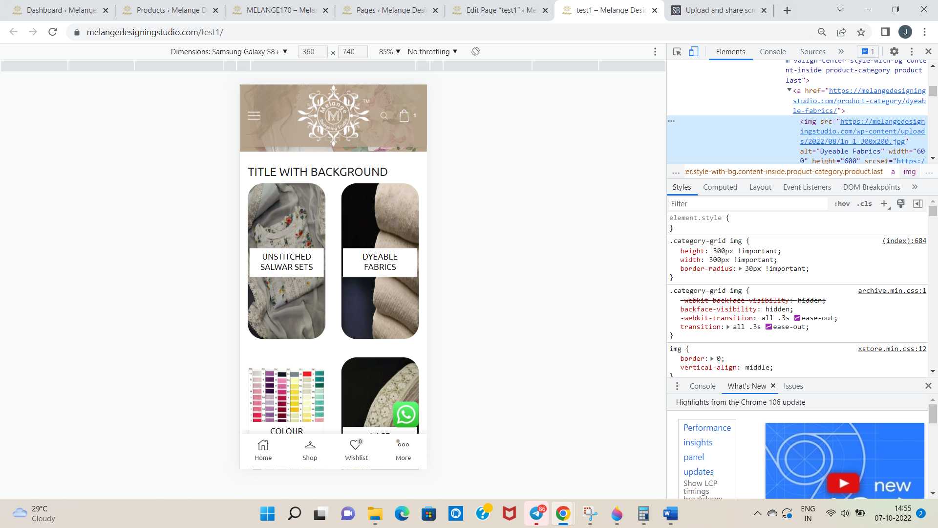
    #1. I have session to display the product categories, I have made it using product category element of xstore. I have 4 categories and in the web I made this 4 categories in one row, but when coming to mobile view by default only one category is showing in one row how can I make it as 2 category in 1 row which will be some more good to see.

    #2. I have tried this in two designs ie, one as title with background colour and second one as zoom. In the zoom how can I add a overlay for the category image so that the category name over the image will be visible. I will share the link of the page I tried. Inside that you can see that in the zoom method the category names have some visibility problem. How can I solve this. Please help

    Page Link : https://melangedesigningstudio.com/test1/

    Thank You

    5 Answers
    Avatar: Tony Rodriguez
    Tony Rodriguez
    Support staff
    October 6, 2022 at 08:18

    Hello, @Saira,

    1- In the widget, there is no option to set the specific column settings for mobile and desktop. So to solve this you have to use the custom CSS code.

    To set the CSS code first you have to know that the category will appear on multiple pages of your site. If you set the code using default category classes it will affect all the categories on your site. So, to set the code only for a specific section first set the “CSS ID” on the widget/element as I did: https://postimg.cc/vDLP3Vx2 I name the ID “Test” so that now I will use the default category class with this ID then my code will only work for this section. This is the default CSS class for the category “.category-grid” and I set the ID “Test” so with the ID and class the code will be like this.

    @media(max-width:768px){
    #Test .category-grid{width:50% !important;}}

    As you can see from the above code I set my ID with the category class just like this you can do it on your site.

    2- To know how to set the overlay color on the product category widget of our theme please watch this video complete: https://streamable.com/jy6iw0

    Regards 8Themes Team.

    Avatar: Saira
    Saira
    Participant
    October 7, 2022 at 08:10

    Thank You for your response, I am using WPBakery page builder. Can You tell how can I add overlay colour in wpbakery

    Thank You

    Avatar: Tony Rodriguez
    Tony Rodriguez
    Support staff
    October 7, 2022 at 09:54

    Hello, @Saira,

    Alright, I have checked and confirmed that this feature is not available in the WP Bakery version for now. But the Elementor have. But as you said that you are using the WP Bakery version on your site. We are currently working on the update. I hope in future coming updates of our theme this option will be included in the WPBakery version too.
    So you can wait or use the third-party plugin which suits your requirement at your own risk.

    You can submit a request here https://www.8theme.com/taskboard/ , so our dev team read it.

    Thanks for your understanding.

    Regards 8Themes Team.

    Avatar: Saira
    Saira
    Participant
    October 7, 2022 at 10:25

    As you told I have given the code for two column, it is coming like two column in one row of phone view, but the problem is that the image is stretched. How can I solve this

    Thank You

    Screenshot : https://snipboard.io/9A6fsz.jpg

    Avatar: Tony Rodriguez
    Tony Rodriguez
    Support staff
    October 8, 2022 at 05:56

    Hello, @Saira,

    Actually, the images are not stretched because of my code check here I remove the code, and then the image started appearing 1 in a row https://postimg.cc/NKYZPGhd see the image already appears like this. By setting two columns with the given code mine the image results much better than it appears in 1 column in 1 row. Please check this image: https://postimg.cc/XrJkvt9V

    Secondly, I have found a CSS code on your site that is set for the width and height of the images check here: https://postimg.cc/yDkpGDQX by default WooCommerce handles the product/category images and WooCommerce has an option to set the product images size. You can find it in the Theme Options >> WooCommerce >> Product Images: https://postimg.cc/2qH6SXFf using a CSS code to set the product/category images size is not a good way when the plugin provides an option. Please try to remove that CSS code that was added to set the width and height of the product images and then try to set the size using the options the plugin provides. The CSS code I share with you to show the 2 columns on mobile is not responsible for the images stretched.

    Regards 8Themes Team.

  • Viewing 6 results - 1 through 6 (of 6 total)

You must be logged in to reply to this topic.Log in/Sign up

We're using our own and third-party cookies to improve your experience and our website. Keep on browsing to accept our cookie policy.