Creating custom dropdown menu - by MJ - on WordPress WooCommerce support

This topic has 17 replies, 3 voices, and was last updated 2 years, 9 months ago ago by Olga Barlow

  • Avatar: MJ
    MJ
    Participant
    July 1, 2021 at 05:18

    Hi,
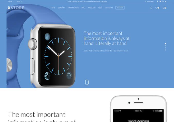
    i want to create a menu like apple.com. on header right side, they use a bag icon and when you click you will see your account, cart and favorite and sign in as a drop down menu. i also need the styling like rounded menu corners and full screen mode for mobile devices.
    1. how can i use extra menu (secondary menu) in mobile?
    2. i made a menu with icon but my icon and tile have no spacing in between. how can i give spacing?
    3. can you give me some link on how to do above?
    4. how can I fix the header in its position? i dont want it to hide during scroll?

    Please, contact administrator
    for this information.
    16 Answers
    Avatar: Olga Barlow
    Olga Barlow
    Support staff
    July 1, 2021 at 11:51

    Hello,

    1) Go to Header builder > edit Mobile menu > Extra Tab Content > choose the menu and select your secondary menu there.
    2) Add the below code to Theme Options > Custom CSS

    .et_b_header-menu .nav-sublist-dropdown .item-link > i {
        margin-right: 5px;
    }

    3) We don’t have the option for the cart element to show the menu after clicking by the icon. Our cart element displays only items added to the cart and the checkout button. If you need someyhing extra you may submit cutomization request here because support does not include customization service.

    4) Go to Header Builder > Sticky header > choose Sticky type and enable it for the Main header area for both desktop and mobile if you need it.

    Regards

    Avatar: MJ
    MJ
    Participant
    July 2, 2021 at 00:43

    Hi thanks for support.
    1. i was not talking about extra tab in mobile menu. i was asking if the option second menu can be use separately in mobile header. means one Mobile Menu and one secondary menu like what is available in desktop.
    4. if you check i did not use cart option to create dropdown menu (it is just a bag icon of menu). i made a menu with icon and use secondary menu to place it in header. if i can use this secondary menu in mobile version, it would be perfect.

    and i have an additional issue now, my search and mobile menu setting is to open in full screen. but it does not function and no screen showed after clicking them. can you please check.
    And is it possible to add only static blocks from your premade templates?

    Avatar: Olga Barlow
    Olga Barlow
    Support staff
    July 2, 2021 at 14:08

    Hello,

    1. Mobile header builder does not include the secondary menu element, unfortunately.
    4. I got your idea but unfortunately, secondary menu is not available for mobile. But I have created custom widget area and added menu element to that. Then I used the Widget element in the mobile header to show the custom WIdget area. Check your mobile header now.

    Regards

    Avatar: MJ
    MJ
    Participant
    July 5, 2021 at 04:52

    Hi
    that works for me. i have additional questions:
    1. now that we used widget, the CSS code you gave me before does not work for mobile to give separation between icon and text in the menu. your CSS below works for desktop. can you give me one for mobile?

    .et_b_header-menu .nav-sublist-dropdown .item-link > i {
        margin-right: 5px;
    }

    2. my search and mobile menu (mobile mode) set to open in full screen. but when you click now, there is no screen showing up. its strange, the side bar settings are working fine. can you check that for me?

    3. is it possible to add only static blocks from your premade templates? i want to use one footer from another template.
    thanks again!

    Avatar: Olga Barlow
    Olga Barlow
    Support staff
    July 5, 2021 at 11:37

    Hello,

    You are welcome.
    1) Replace the previous code with the following

    .et_b_header-menu .nav-sublist-dropdown .item-link > i, .etheme_widget_menu .nav-sublist-dropdown .item-link > i {
        margin-right: 5px;
    }

    2) What’s this and why did you add that code https://prnt.sc/18pyolh ? It causes the issue. Edit the Yellow pencil code that you added and remove the mentioned custom.

    3) You can import Static Blocks only while importing the demo content. For example https://gyazo.com/c4ad9ef61c7857b655bb18be81e72b5d

    Regards

    Avatar: MJ
    MJ
    Participant
    July 6, 2021 at 08:04

    Awesome, all above resolved, Thanks.
    here’s some more:
    1. https://okayside.com/product/belgian-waffles/ In single product page: i guess when i created new menu with icons for Wishlist and cart, the same icons appears in product page. So now there are 2 icons for Wishlist.
    2. same page: how can i remove Compare option?
    3. same page: when click on Wishlist, it adds to the list and once you click again go to 404 page instead of Whishlist page. please check for me?
    4 how can i replace default 404 page?
    5. for all woo commerce pages there is no padding on top of the page. i would like to add some padding.
    6. the new widget menu in mobile mode: can i make it full screen?
    thanks

    Avatar: Olga Barlow
    Olga Barlow
    Support staff
    July 6, 2021 at 14:53

    Hello,

    You are welcome.

    1) Check the docs and set the settings for the icon according to documentation https://xstore.helpscoutdocs.com/article/102-wishlist

    2) Go to Plugins > disable Compare plugin and remove it if you don’t need that option.

    3) Make sure that you created wishlist page with the [yith_wcwl_wishlist] shortcode into the page content. After that go to YITH Wishlist > Wishlist page options > set the correct wishlist page there

    4) Go to Theme Options > 404 page > add the content you want to display there.

    5) Use the below code

    .woocommerce .content-page, .woocommerce .page-content {
        padding-top: 20px;
    }

    6) Are you talking about this drop-down https://prnt.sc/1910zzz ?

    Regards

    Avatar: MJ
    MJ
    Participant
    July 7, 2021 at 01:10

    Thanks again! FYI, i did change the password, please use the new one.

    1. works for wishlist, but cart and buy now still have the icons. how can i remove them as well?
    4. i created a new 404 page for example. how can i replace it with default one. i could not find the default 404 in my pages list.
    6. yes i am referring to that menu.
    7. and how can i adjust a setting in a way that once i click on add to cart or wishlist an off-canvas shows up?
    Thanks

    Please contact administrator
    for this information.
    Avatar: Rose Tyler
    Rose Tyler
    Support staff
    July 7, 2021 at 10:33

    Hello,

    1/ Add the next code in Theme Options > THeme custom CSS:

    .single_add_to_cart_button:before {
        display: none;
    }

    4/ Theme Options > 404 page > 404 Page Content
    6/ Add the next code in Theme Options > Theme custom CSS > Custom CSS for mobile:

    .mobile-header-wrapper .menu li.menu-disable_titles .nav-sublist-dropdown {
        width: 100vw;
        margin-right: 0 !important;
    }

    7/ These elements should be added in the header content in Theme Options > Header builder

    Regards

    Avatar: MJ
    MJ
    Participant
    July 7, 2021 at 14:30

    Awesome thanks very much
    6. I also need it for tablet. Please also add tags for color and alignment right center and left. I can add those tag for mobile by myself.

    8. Do you have any documentation for html block in your theme header. I want to create a html menu like what you have for 8theme.com mobile. I tried to find docs in your library but no luck. Can you provide a link?
    TQ

    Avatar: Olga Barlow
    Olga Barlow
    Support staff
    July 7, 2021 at 17:27

    Hello,

    In this case, remove the previous code and add the code below to the global CSS

    @media only screen and (max-width:992px){
    .mobile-header-wrapper .menu li.menu-disable_titles .nav-sublist-dropdown {
        width: 100vw;
        margin-right: 0 !important;
    }
    .mobile-header-wrapper .menu li.menu-disable_titles {
        position: static;
    }
    }

    You can change colors, alignment only by custom CSS, if you have appropriate skills or you, may try Yellow pencil plugin but it would better if you are familiar with the CSS because the plugin generates the wrong code sometimes.

    8) We don’t have documentation for this, unfortunately. HTML block supports HTML code and shortcodes. Don’t use PHP and JS code there. To create the menu like we have on 8theme.com not just HTML code is required but also JS, CSS. So, you could implement this only if you have the mentioned skills. Or submit customization request here because additional customization is not included in our support https://themeforest.net/page/item_support_policy

    Regards

    Avatar: MJ
    MJ
    Participant
    July 8, 2021 at 09:53

    Got it, thanks! And password reset.
    1. I added 2 tags for background and alignment. i just need your help with text color that i could not find for the menu.

    @media only screen and (max-width:992px){
    .mobile-header-wrapper .menu li.menu-disable_titles .nav-sublist-dropdown {
        width: 100vw;
        margin-right: 0 !important;
    		background-color: #333333;
    		text-align: center;
    		
    }
    .mobile-header-wrapper .menu li.menu-disable_titles {
        position: static;
    }
    }

    2. i also need the CSS to control widget padding. if you check in tablet version, the icon is far left and so much space at right. i want the menu icon stays in relative position like the mobile menu dose on other side.

    3. last thing is that i used custom link to create the icon menu. the problem is when i click on it, it jumps to okayside.com/# which i know why. i need your advise if i can use something other than custom link for the top menu item so that once it clicked no action happens. like a natural item to contain only the icon and submenus .

    Please contact administrator
    for this information.
    Avatar: Olga Barlow
    Olga Barlow
    Support staff
    July 8, 2021 at 14:00

    Hello,

    1) Do you want to change it for mobile-only or for the desktop too?
    If you want to change for both then edit drop-down settings https://prnt.sc/19hjmp2

    2) Use the right alignment for the element https://prnt.sc/19hkce4

    3) Menu does not have the option to disable the item link, unfortunately. You can try to implement it by custom JS https://www.w3resource.com/jquery-exercises/part1/jquery-practical-exercise-35.php

    Regards

    Avatar: MJ
    MJ
    Participant
    July 8, 2021 at 14:33

    Thanks, for 1 is working good.
    For 2, is working so so. Can you give me the padding\margin css for widget? I want to play around with it for better result.
    For 3, are you suggesting I amend the index files on server side? Can you give me more details? Name of the files would do. I don’t want to mess overall coding.

    Avatar: MJ
    MJ
    Participant
    July 9, 2021 at 08:18

    Hi
    I did remove the # from menu top link and the problem for #3 is resolved.
    for #2 i use below and it work fine. is this code ok to be used?
    @media only screen and (max-width:992px){

    /* Link */
    .menu-element .menu > .menu-item > a{
    padding-right:10px !important;
    min-height:20px;
    width:23px;

    }

    }

    Avatar: Olga Barlow
    Olga Barlow
    Support staff
    July 9, 2021 at 16:50

    Hello,

    2/ I would recommend you to align connection block content to right instead of the custom that you use. But if you prefer custom – ok, if it suits your needs.
    3/ Ok.

    Regards

  • Viewing 17 results - 1 through 17 (of 17 total)

The issue related to '‘Creating custom dropdown menu’' has been successfully resolved, and the topic is now closed for further responses

We're using our own and third-party cookies to improve your experience and our website. Keep on browsing to accept our cookie policy.