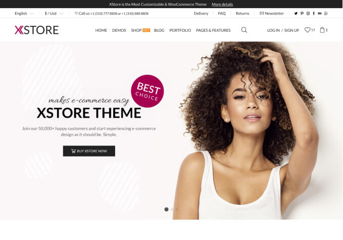
Boost Sales with WooCommerce WordPress Themes for Mobile Design
Transform your online store into a powerhouse of functionality and convenience with responsive mobile design in WordPress WooCommerce themes. In this digital age where smartphones have become an integral part of our lives, it's no surprise that a majority of consumers prefer doing their shopping online. Therefore, having a mobile-friendly website isn't just a nice feature anymore—it's a necessity. Not only does this affect your customer's overall shopping experience, but it also significantly impacts your site's SEO and performance.
Responsive mobile design ensures your WooCommerce store is seamlessly accessible across all devices. This means that the layout and content of your website will automatically adjust according to the size of the device being used. It's about making sure that your customers can easily navigate your site, read descriptions, make purchases, and view images, all without having to zoom or scroll excessively. But beyond convenience, responsive design offers a professional and polished image for your business, showing customers that you're committed to providing them with the best possible shopping experience.
Furthermore, responsive mobile design significantly benefits SEO rankings. Google has openly stated that mobile-friendliness is a ranking factor for their algorithm. Websites that aren't optimized for mobile usage tend to rank lower, resulting in less visibility and traffic. By investing in a responsive WooCommerce theme, you're setting up your online store for maximum visibility and reach, thereby increasing potential sales and revenue.
Implementing a responsive WooCommerce theme can indeed make a world of difference to your conversion rates. Websites that aren't optimized for mobile use typically see a higher bounce rate. This is because many users will not have the patience or time to navigate a site that is difficult to view on their mobile device. By ensuring that your website is mobile responsive, you can keep your customers engaged longer, therefore increasing the likelihood of converting visits into sales.
Finally, having a responsive WooCommerce theme for your WordPress website future-proofs your online store. As technology continuously evolves, so will the devices that your customers will use to access your website. With a responsive design, you can rest assured that your website will continue to function flawlessly, regardless of the screen size or device your customers use. If you're serious about providing a top-notch shopping experience for your users, investing in a responsive mobile design for your WordPress WooCommerce theme should be at the top of your list.
