sorry can you please tell me which specific code has been added twice please?
sorry can you please tell me which specific code has been added twice please?
nearly there all these codes removal are affecting other things on the site:

ok almost there but its still slightly down:
Thank you!
It’s fine now thank Goodness i didnt get too far!
i have restored the databse.
Thank you!
Perfect thank you!
Thank you!
Hi sorry thought i had added it:

its fine now, ive done a database restore, still do you know why this happens? As ive had this before?
Thanks,
please see private content.
Thank u!
No mine is definately different, this is what i get on ipad/safari:
http://s9.postimg.org/cydusrcxb/Attachment_1_1.jpg
this is what i get iphone/safari:
http://postimg.org/image/bp88zdixp/
Can i get the ipad menu to look like the iphone version please?
Please take note of he codes above…
Thank you!
Thank you!
You guys are great!
Thanks that worked!
sorry wrong theme
hi that did not work i have similar code and may be thats whats conflicting, here is the code i have already:
.menu > li > a {
color: #000;
cursor: pointer;
display: block;
float: left;
font-size: 11px;
line-height: 15px;
padding: 20px 9px 15px;
position: relative;
text-transform: uppercase;
}
.header-logo img {
max-width: 323px;
}
@media (max-width: 1200px) {
.header-logo img {
max-width: 260px;
margin-left: -10px;
}
.header-type-12 .navbar-collapse .menu > li > a {
padding: 10px 10.5px !important;
}}
.header-type-12 .navbar-collapse .menu > li > a {
padding: 10px 17px;
}
i just need the menu/header to collapse in the mobile ipad/iphone version, just like here:

Please let me know what to do, thank you.
yes pls thanks!
Acutally please leave it thanks!
Hi i do aplogise, the logo is wrong i have corrected this, can you please have another look?
But YES what you did is what i want, (just the wrong logo was used)
please make sure that the logo is big (visible)
it is responsive on all platforms
thank you so much
hi eva, any updates pls?
hi eva,
sorry i am not getting anywhere with this if i give temporary acess can you please go in and fix for me?
ok thats fine, its needs to be responsive too, it is not at the moment
hi Eva,
That sort of worked, the logo is cut off a little and the pink side of the cart is not all the way to the top, i can still see a bit of white space, what to you suggest make the logo smaller, as i want the logo to be as big as possible!
Ok but the top part where the cart is, is not touching the top of the page like:
please advise.
many thanks
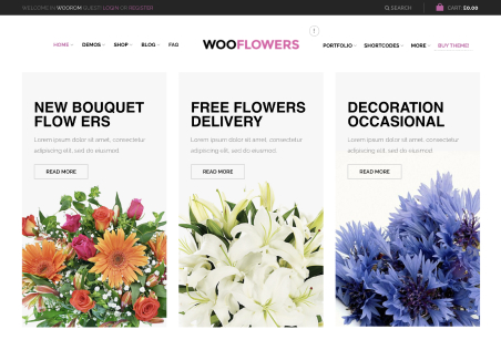
i would like the logo to be slightly bigger and would like the menu to look like here:
the boxes seem too big in:
last time someone helped me, can you please help me again pls?
hi eva that looks o, but i want the image to fill the top of that page, is that possible, if so, what size should it be please?
no that didnt work for me, the category image is still not showing up!
thank you!
thank u!

