Thanks a lot
Thanks a lot
Oh, I’m sorry
Where does she work? I don’t see such settings in the search:(
and the most important question is, will the website take longer to load because of these banners?
I got it, thank you, but can you also help me with the styles? The indentation is the same, the line break is also 2 lines, and I want to remove all the capital letters like in the top. We need to replicate the style of the top images as much as possible, but we also need to be able to highlight the text)
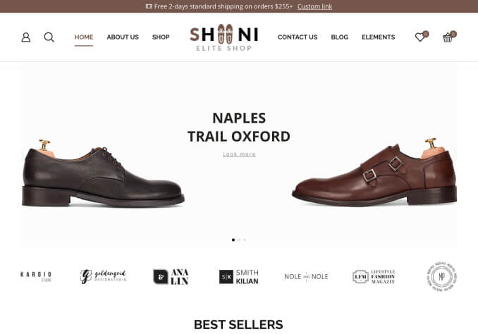
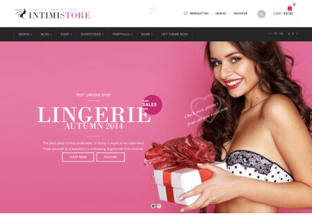
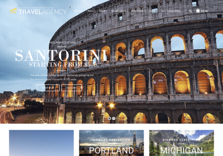
Unfortunately, this code doesn’t do anything, but I’ll try to explain it differently. We need the banner to be in the following proportions on a PC: 1436×395, and on a mobile device, it should be 1436×700. The screenshot shows how it’s currently done with images, but we want to remove them and keep only the banners.
thanks, I got it from the text, but is it possible to have one banner size on a PC and another on a mobile? For example, a PC with width=”900″ and height=”316″, and a mobile with 900 × 700 ?
I want to make 2 banners that are exactly the same as the images above, narrow on the PC, wider on the mobile, and have the text displayed exactly on the banners with a shift, font, and remove the images altogether and keep the banners, is this possible?
It is a pity that we cannot use some of the theme’s features due to different designers.
Is it possible to do this within our constructor? Or do I need to switch to Elementor completely for this purpose?
Thanks for the support! My topic “Can you help me style the basket icons with color?” has been successfully resolved.
Great, thanks.
Please check again
Done
Thanks for the support! My topic “How can I make a block like this, when the regular tab widget looks different?” has been successfully resolved.
Yes, it’s the same as mine, but in that demo, it seems to be Elementor, so it doesn’t work on WPBakery Page. The tabs are lost on mobile, and you have to scroll down to see the other tabs. In Elementor, it’s convenient because all the tabs are visible at once.
Okay, thank you, wc-cart-fragments helped! You’re the best!
thank you, and you can see all the tabs on your mobile, but we can only see one on top, and the others are on the bottom
I also put a tab, but your style is different, and it displays differently on mobile
I want to implement the same block as in your demo, but I don’t understand how to do it. Is it Tab or something else? How can we do it? we want exactly this block with tabs and style
We want to highlight the background of the cards in white, like on the main page
Hello, everything is starting to shift, is it possible to do it without shifting, like in carousels?
Great, thanks a lot.
I’m dropping it, but please don’t update the plugins, I’ll do it myself if necessary 🙂
That’s how it becomes
Thank you, but can I do the same on my mobile?
Thanks, but can I level up some more?
Now it’s like this without margin, but I would like to add it without shifting the products (6 in a row as it is done below)
With your code, everything shifts, that’s almost what you need, but margin also shifts the cards and does not fit 6 in a row.
.products-grid > div.product {
background-color: #fefefe !important;
box-shadow: 0 20px 30px rgba(53, 51, 57, .06);
border-radius: 10px;
margin:3px;
}
I probably described it wrong, I also need to add a white background to the product cards with the grid type, as I understand it, you need to add something like: .products-slider .swiper-slide .product-grid (this does not work) {
background-color: #fafafa !important;
}