Wording disappear when view on iphone - by zouking

This topic has 2 replies, 2 voices, and was last updated 8 years, 2 months ago ago by Eva Kemp

  • Avatar: zouking
    zouking
    Participant
    February 4, 2016 at 09:34

    Hi,

    I got few questions.

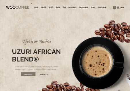
    My wordings on banner disappear when view on iphone. But it’s fine when view on desktop and ipad. Refer to private content for screen shot.

    And my logo is clear when view on chrome or firefox. But it’s blurred when view on IE and edge. Refer to private content for screen shot.

    And how to close the gap between each row of banner. It’s fine when on chrome. But when view on IE and edge, there is a gap in between. Refer to the logo screenshot as well.

    Thanks.

    Please, contact administrator
    for this information.
    1 Answer
    Avatar: Eva
    Eva Kemp
    Support staff
    February 4, 2016 at 15:42

    Hello,

    Please add this code in Theme Options > Custom CSS > Custom CSS for mobile:

    .banner .banner-content p {
        display: block;
    }
    .banner {
       margin-bottom: 0px;
    }

    Concerning the logo, these are the features how MS Edge browser scales big images. Sorry, but it’s not related to the theme.

    Regards,
    Eva Kemp.

  • Viewing 2 results - 1 through 2 (of 2 total)

You must be logged in to reply to this topic.Log in/Sign up

We're using our own and third-party cookies to improve your experience and our website. Keep on browsing to accept our cookie policy.