Good morning
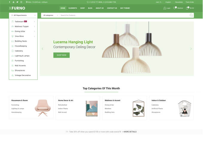
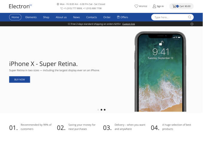
I just updated WooPress to version 6.5.3, and now not all of the page content is displayed, and it doesn’t adapt to any screen size. On a PC monitor, you have to zoom out to see all the content, but on a mobile phone or iPad, if there are three rows per header, only two are visible.
https://prnt.sc/TedXZFWz1S5j
This is how it should look, but it can only be achieved by reducing the image, in the PC version, in the rest on iPad or responsive mobile it does not work.
This is how it should look, but it can only be achieved by reducing the image, in the PC version, in the rest on iPad or responsive mobile it does not work.
thank you, it’s urgent


