Too much spacing on Tablet and mega menu label alignment

This topic has 6 replies, 3 voices, and was last updated 2 years, 8 months ago ago by Rose Tyler

  • Avatar: themelover
    Kelly
    Participant
    August 16, 2021 at 21:17

    I have two issues:

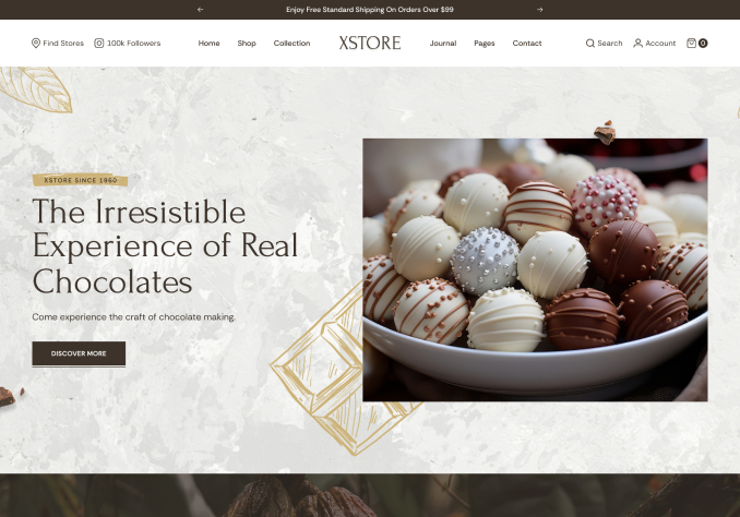
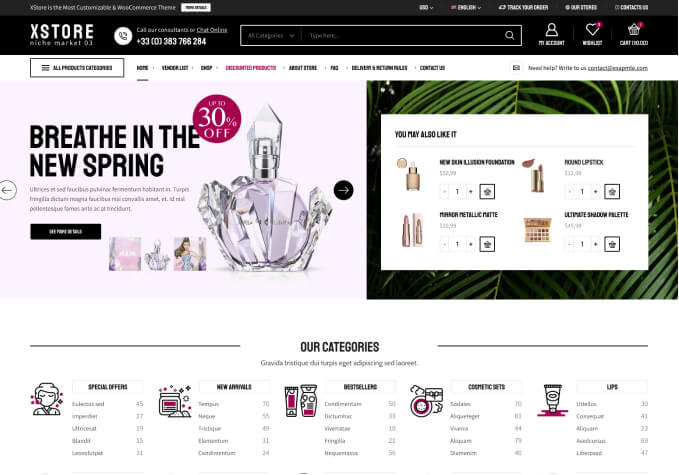
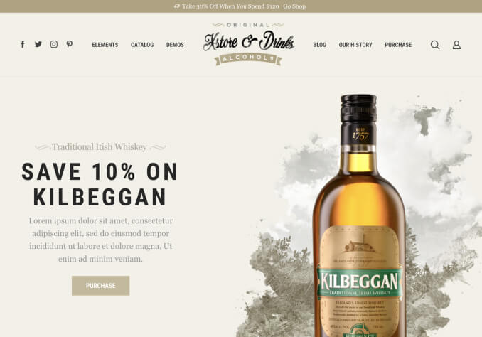
    1. The website view of home page view on desktop and mobile is fine. But there is too much blank lines in between sections for tablet. Screen shot 1 and 2.

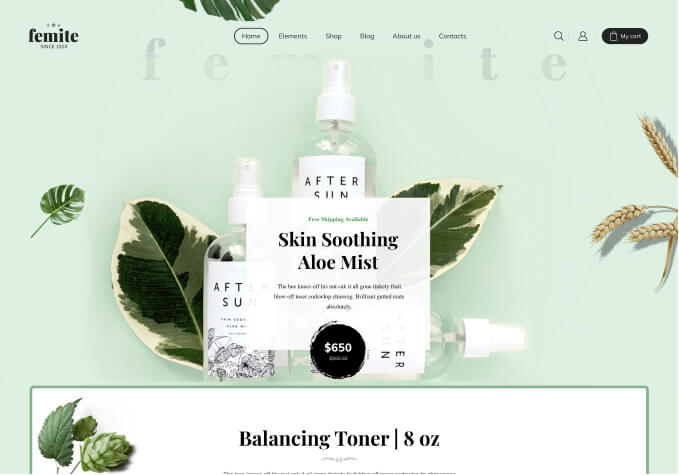
    2. In mobile and tablet view, the mega menu label appear on the left. How to align it below the respective image. And why is the image appear to be tinted? Screen shot 3.

    Please refer to the screenshot provided in private content area.

    Please help. Thank you.

    Please, contact administrator
    for this information.
    5 Answers
    Avatar: Olga Barlow
    Olga Barlow
    Support staff
    August 18, 2021 at 12:02

    Hello,

    1) Yes, because you added 150px padding for the section https://prnt.sc/1qa2bf2 Edit your page and change the padding for the tablet resolution using Elementor settings https://prnt.sc/1qa2ko5 .
    2) The same issue with padding here https://prnt.sc/1qa2dhs You set slide bg https://prnt.sc/1qa2hoo
    3) Provide us with WP Dashboard access to check the issue with the menu in more detail.

    Regards

    Avatar: themelover
    Kelly
    Participant
    August 19, 2021 at 07:07

    The WP dashboard access is included in the private content area.

    Please contact administrator
    for this information.
    Avatar: Rose Tyler
    Rose Tyler
    Support staff
    August 20, 2021 at 12:12

    Hello,

    Thanks for the reply.
    Please update the theme and Core plugin – https://xstore.helpscoutdocs.com/article/63-theme-update https://xstore.helpscoutdocs.com/article/37-plugins-update Then clear cache of browser on your mobile and check the menu.

    Regards

    Avatar: themelover
    Kelly
    Participant
    August 20, 2021 at 19:58

    I had updated the theme and core plugin. Clear cache. Just checked the menu on mobile. the mega menu still have the same issue, where the label appear beside the image. I need the label to appear below the image.

    Please help to check. Thank you.

    Avatar: Rose Tyler
    Rose Tyler
    Support staff
    August 21, 2021 at 07:58

    Hello,

    Thanks for the reply.
    Add the next code in Theme Options > Theme custom CSS > Global custom CSS:

    .mobile-menu-content .menu-item-object-product_cat a {
        -webkit-box-align: center;
        -ms-flex-align: center;
        align-items: center;
        -webkit-box-orient: vertical;
        -webkit-box-direction: reverse;
        -ms-flex-direction: column-reverse;
        flex-direction: column-reverse;
    }
    .mobile-menu-content .menu-item-object-product_cat img {
        margin-bottom: 10px;
    }

    Regards

  • Viewing 6 results - 1 through 6 (of 6 total)

You must be logged in to reply to this topic.Log in/Sign up

Helpful Topics

We're using our own and third-party cookies to improve your experience and our website. Keep on browsing to accept our cookie policy.