The mobile responsive header in my theme isn’t working properly.

This topic has 2 replies, 2 voices, and was last updated 2 months, 3 weeks ago ago by Alex Carter

  • Avatar: samarasiri
    samarasiri
    Participant
    September 12, 2025 at 11:57

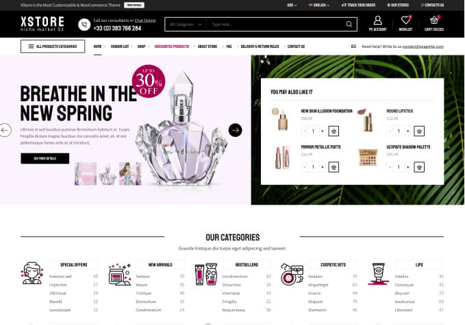
    As shown in the first image, when I edit from the theme, it works fine, but when I view it from another browser or on my mobile phone, it is confusing. What should I do about this?

    Files is visible for topic creator and
    support staff only.
    1 Answer
    Avatar: Alex Carter
    Alex Carter
    Support staff
    September 12, 2025 at 12:25

    Hello,

    Thank you for reaching out to us.

    We suggest that you turn off the Mobile Optimization option in (XStore > Theme Options > General) if you are using a cache plugin for mobile devices, as both optimization options can conflict with each other and will not improve the speed together.

    Or

    Disable all third-party plugins that are not included with XStore (https://www.8theme.com/documentation/xstore/plugins/included-plugins/). After doing so, please clear your browser’s cache and check again. It is possible that one of these additional plugins is causing the issue.

    Warm Regards,
    The 8Theme Team

  • Viewing 2 results - 1 through 2 (of 2 total)

You must be logged in to reply to this topic.Log in/Sign up

We're using our own and third-party cookies to improve your experience and our website. Keep on browsing to accept our cookie policy.