Hello,
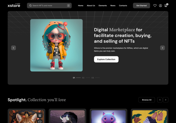
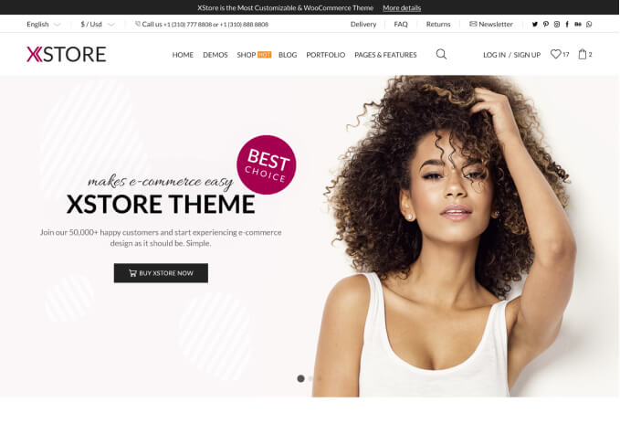
I’m having a persistent issue with the XStore Slider.
I’m using a 4K TV (3840×2160 resolution) with Windows display scaling set to 300% (recommended).
When I upload a slider image sized 1920×700, it appears zoomed in / enlarged in the browser.
Because of that, part of the image is cropped, and I need to scroll down to click the button on the slider.
The strange part is that this does not happen on my Shopify site with the exact same image — there it displays perfectly, without zoom or cropping.
It looks like the XStore slider (or container) doesn’t correctly handle high-DPI / high-scaling displays (DPR = 3), since on a 4K screen with 300% scaling, the browser interprets the viewport as ~1280px instead of 3840px.
I’ve attached a screenshot clearly showing the issue — you can see that the slider is visibly zoomed in, the text is partially cut off, and the layout does not adjust correctly. The only way to see it properly is by manually reducing the browser zoom, which should not be necessary.
Could you please check if this behavior is expected, and confirm whether:
The XStore Slider and the theme layout are fully compatible with 4K displays and Windows scaling above 100%?
There is a recommended image resolution or CSS adjustment to ensure the slider displays proportionally across all screens (without zooming or cropping)?
Thank you in advance for your help — I’ve been trying to solve this for several days and would really appreciate your guidance!