1) Grouped product page layout (in mobile),
– quantity set /single item name/ price section not aligned well on mobile.
– quantity box seems like this on mobile:
<
[0]
>
– not aligned well: quantity box seems middle aligned but single item name and price seems top aligned (both pc and mobile)
for fixing single item name (if it’s too long), I tried to implement ellipsis option in css, but it only applied to single row, is is possible to implement this with 2-3 rows?
(It’s too short if set width in css to 100px and whole layout totally messed up if set it longer.)
and how can I fix to display quantity box (with arrows) in a single row?
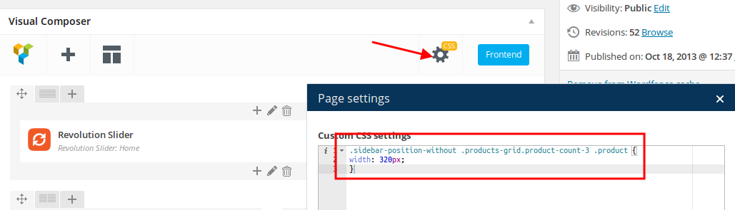
2) I tried to put widgets ( mega search, etc.) on the “place in header top bar”, but it’s show only when I enable “language area” which I don’t want it to be enabled.
Is it possible to put something in header?
3) I put “featured products” with “slider” format (3 items in a row) and then “recent products” with “grid” format (set column option to 3) in the homepage,
but those layout doesn’t match as I wanted. size seems different
Is it possible to assign size (width,height) of those items or any workarounds?
Best,
JP