Responsive Issues with banner size - by ianabel

This topic has 13 replies, 4 voices, and was last updated 4 years, 5 months ago ago by John Holden

  • Avatar: ianabel
    ianabel
    Participant
    October 4, 2019 at 16:46

    Hello,

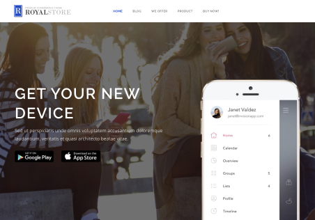
    The home page banner doesn’t seems to be responsive because it doesn’t adjust the size for ipad or mobile version. See screenshot Wrong banner size on mobile It just cut the image on both sides intead of resize it.

    12 Answers
    Avatar: Rose Tyler
    Rose Tyler
    Support staff
    October 4, 2019 at 17:13

    Hello,

    Try to add this code in Global custom CSS:

    @media only screen and (max-width: 992px) {
        .slider-item {
            background-size: contain;
            background-repeat: no-repeat;
        }
    }
    @media only screen and (max-width: 480px) {
        .swiper-entry.et-slider {
            height: 300px !important;
        }
    }

    Regards

    Avatar: ianabel
    ianabel
    Participant
    October 5, 2019 at 09:34

    Thank you very much, now it has the proper size. But the button on the slider have change the position and is treading the text (text is part of the image). I need the button keep the relative position as in desktop version. Please see screenshot https://www.ia-incosmetics.com/wp-content/uploads/2019/10/image1-4.png
    Also need to make button smaller only for mobile version. Now it looks too big according to the slider image.

    Thanks!

    Avatar: Rose Tyler
    Rose Tyler
    Support staff
    October 5, 2019 at 11:01

    Hello,

    Unfortunately, there is no such possibility. I would recommend you to add the text manually on the slider, as on our demos. The size of the button can be changed via custom CSS code –

    .slide-button {
        padding: 8px 15px !important;
        font-size: 11px !important;
    }

    http://prntscr.com/pf67sh
    Also, you can use the Slider Revolution plugin, it has more settings but can slow down the site a bit.

    Regards

    Avatar: ianabel
    ianabel
    Participant
    October 5, 2019 at 11:33

    1.OK, It works great. Instead of keeping the relative position as in desktop version, could be possible set the button at the bottom of the image always, for mobile version? I mean, over the navigation bullets?

    2.In that case I will use navigation arrows and I would like to know if it is possible to set transparent the square around the arrow so it doesn’t cover that much image.

    Thanks

    Avatar: ianabel
    ianabel
    Participant
    October 5, 2019 at 18:42

    3. I have another small issue with the banner images. In mobile version it shows full, but in desktop version images get cut for the top and the bottom. Now background size is “contain”. I need the images don’t have those cuts in desktop version. I need to know the specific size of the image for full view or a code to fix a size. Please see screenshot https://www.ia-incosmetics.com/wp-content/uploads/2019/10/banner-cortado.jpg
    Thank you!

    Avatar: Rose Tyler
    Rose Tyler
    Support staff
    October 6, 2019 at 14:06

    Hello,

    1) Yes, it should be possible. The button is a part of the slide content so it depends on your settings there. Please describe the desired display of the slider/content in detail and provide temporary wp-admin access, so I can edit your Home page.
    2) [8theme] Slider Settings > Arrows background color > http://prntscr.com/pfjf0p
    3) Try to upload an image in this size http://prntscr.com/pfjh1d

    Regards

    Avatar: ianabel
    ianabel
    Participant
    October 7, 2019 at 10:51

    1. I would like to choose the position I want to place the button in each slider,
    depending of the composition of the image . As the button changes the position depending if is desktop version, tablet or mobile I would like to choose in each device where the button will show. Maybe with some code and changing parameters is possible.

    If is not possible then I would like to fix a position for every slider and device like this screenshot https://www.ia-incosmetics.com/wp-content/uploads/2019/10/sitio-boton.jpg Although it is not a solution that I like very much

    2 and 3 Solved. Thank you very much

    Please contact administrator
    for this information.
    Avatar: Olga Barlow
    Olga Barlow
    Support staff
    October 7, 2019 at 17:13

    Hello,

    If you want to have advanced management of the slide layers for the different devices then I would recommend you to install and use Revolution slider (Appearance > Install plugins). Default Slider WPBakery has limited options but Revolution slider includes a powerful system to edit positions, styles etc https://www.themepunch.com/slider-revolution/responsive-setup/

    Regards

    Avatar: ianabel
    ianabel
    Participant
    October 8, 2019 at 10:52

    Great advice Olga! Now slider shows exactly as I want with Revolution Slider. Thanks

    Avatar: John Holden
    John Holden
    Support staff
    October 8, 2019 at 11:24

    Hi,

    Glad to hear your issue has been resolved. Keep us in mind for future questions and concerns, we’re always here to help!

    If you have a quick minute we always appreciate a 5-star rating on our theme!

    https://themeforest.net/item/xstore-responsive-woocommerce-theme/reviews/15780546

    Your feedback is the motivation to improve our work and services.

    Regards,
    Hung PD

    Avatar: ianabel
    ianabel
    Participant
    October 8, 2019 at 19:58

    Ofcourse, Already rated 😉

    Avatar: John Holden
    John Holden
    Support staff
    October 9, 2019 at 04:27

    Hi,

    Thank you so much. Keep us in mind for future questions and concerns, we’re always here to help!

    Regards,
    Hung PD

  • Viewing 13 results - 1 through 13 (of 13 total)

You must be logged in to reply to this topic.Log in/Sign up

We're using our own and third-party cookies to improve your experience and our website. Keep on browsing to accept our cookie policy.