This topic has 6 replies, 2 voices, and was last updated 8 years, 10 months ago ago by Eva Kemp
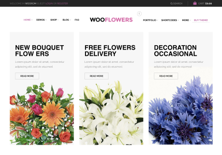
Hi, I’m trying to make the headings and buttons on my site responsive, but media queries arn’t working and mess everything up. I just want these 2 things to look better on mobile and tablet. Please see screenshot: http://prntscr.com/7jvuha
Please can you advise.
Thanks
Hello,
Please add this code in custom.css file:
@media only screen and (max-width: 768px) {.main-footer .btn.big i {
margin-right: 2px;
font-size: 15px;
}
.main-footer .btn.filled.big {
width: 100% !important;
font-size: 12px !important;
}
.main-footer h3 {
font-size: 20px !important;
}}
How to create custom.css you can watch in this tutorial (it’s for Legenda theme but the process is the same).
Regards,
Eva Kemp.
Hi I added that to my child themes style sheet but it has made no difference! still the same.
Thanks
Hello,
I’ve edited the code a bit.
Please check now.
Regards,
Eva Kemp.
where is the new code?
Hello,
The code is the same. I’ve just changed @media only screen and (max-width: 989px)
. The code is in your child style.css.
Is footer shown fine now?
Regards,
Eva Kemp.
You must be logged in to reply to this topic.Log in/Sign up