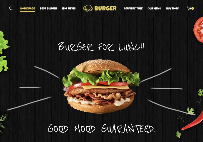
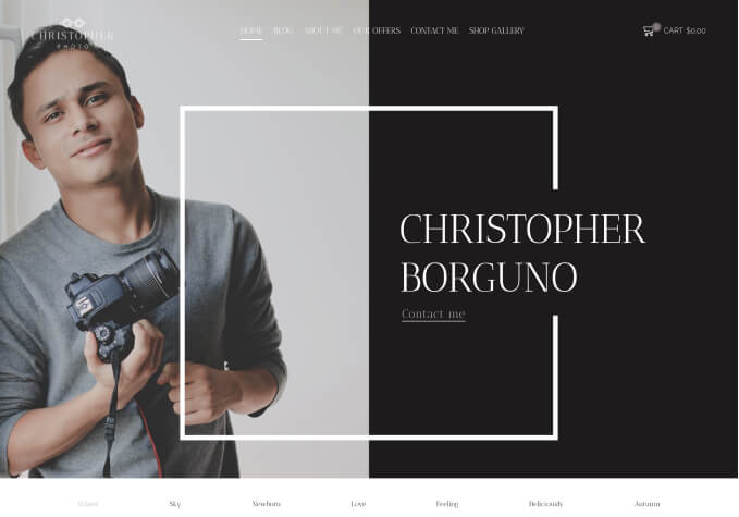
I added the following code to Global Custom CSS to widen the fixed navigation, and it worked fine on the desktop and laptop.
However it keeps staying open in the smart phones, and creating problems.
.fixed-header-area .collapse {
    display: table-cell !important;
    width: 70%;
}
Please let me know how I can widen the Fixed Navigation without messing up the responsive functionality.


