Hi Team,
I hope you are doing well.
I am currently working on my website using the XStore theme and facing an issue while designing the footer section. I have tried multiple settings and adjustments, but I am unable to achieve the desired layout properly. Sometimes the content shifts incorrectly, and other times the alignment breaks, especially across different screen sizes.
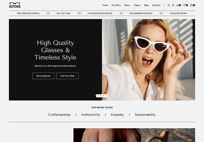
My requirement is to have the newsletter signup section (yellow block) positioned in a clean, centered, and slightly overlapping style within the footer — similar to the demo layout you have provided.
Below are my expectations clearly:
The yellow newsletter section should appear centered and properly aligned within the footer
It should have a floating/overlapping effect, just like in your demo example
The rest of the footer (logo, text editor content, policy links, etc.) should remain structured exactly as I have designed
The entire layout should be fully responsive and work properly on both desktop and mobile
I have already created the full footer structure, I just need help in properly aligning and styling this newsletter section so that it looks clean and professional like your demo. After this, all the remaining footer content such as my brand logo, text editor content, and other elements should appear properly below it, without anything getting hidden or overlapping incorrectly.
I have also shared a reference/example for better understanding. Kindly set this up for me accordingly.
Looking forward to your support.
Thank you.