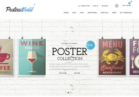
Hello,
In the shop, when I upload a Product Category Header image it appears fine on the desktop. But isn’t ‘responsive’ on mobile versions. How can I either make this responsive, or just hide completely. I’d prefer it to be responsive, but if this is too difficult it would be better to hide it completely rather than for it to look the way it currently does.
Thanks

