Hello again,
PRODUCT CAROUSEL
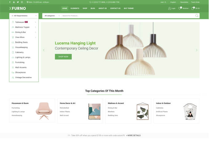
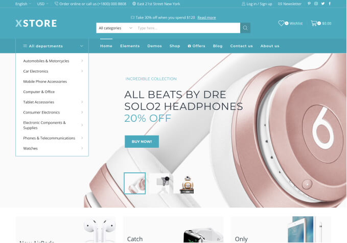
I’ve found some quirky responsive behaviour setting up the product carousel on my home page.
If I set the responsive columns to 5 4 3 2, both tablet and mobile mode appear to display two columns (rather than 3 & 2). The carousel in tablet mode with two columns looks too large and clumsy compared to the other elements on the home page. But three columns looks too small on mobile devices. So, I cannot get the settings to look good on smaller screens.
Note – I am assuming here that when the number of columns of other elements on the page change, so should the carousel’s columns. The other columns shift from 1/3 to 1/2 to 1/1. But the carousel’s columns are at their smallest (mobile) number of columns (2 in this case) when the other columns are at 1/2 (as well as 1/1). This is easy to see if you simply resize the window.
Are the responsive modes working correctly? They do not appear so to me.
CAROUSEL BUTTONS:
When I select ‘hover bottom’ for the buttons, there are two issues:
– I have disabled the ‘quick view’ option, but there is still a white space on the left where the icon was. I’d like to remove the space.
– On the right of the basket icon is ‘Add to Basket’ text which is redundant and is subject to layout issues. Is there a way in which this text can be removed please?
Many thanks in advance
–Gary.


