Problems to fix part of the desktop site menu and part of the mobile site menu

This topic has 2 replies, 2 voices, and was last updated 4 days, 5 hours ago ago by Luca Rossi

  • Avatar: Creative
    Creative
    Participant
    June 13, 2025 at 09:44

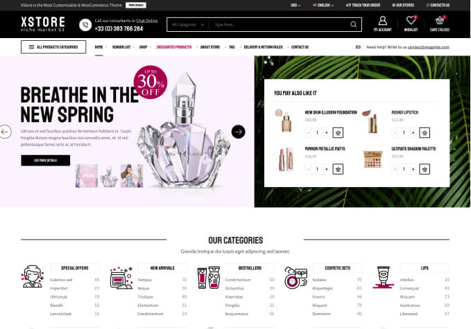
    Good morning, as you can see in Allegato1, opening the categories menu opens an infinite and long menu for the whole page, can you reduce it and make it scrollable? From mobile instead as you can see in Allegato2, the link of the dropdown item does not work, clicking opens the submenu but I can not go to the dedicated page even though the link is there.

    Allegato2 http://file.multimediacreativeagency.eu/creative/Allegato2.mp4

    Allegato1 http://file.multimediacreativeagency.eu/creative/Allegato%201.mp4

    Content is visible for topic creator and
    support staff only.
    1 Answer
    Avatar: Justin
    Luca Rossi
    Support staff
    June 13, 2025 at 17:58

    Dear @Creative,

    We hope this message finds you well.

    Please find below the custom CSS code that limits the height of sub-menu items. A scrollbar will appear automatically when the content exceeds the specified height:

    
    .etheme-elementor-nav-menu ul .nav-sublist-dropdown > div > ul {
        max-height: 500px;
        overflow-y: auto;
    }
    

    Regarding the mobile menu functionality, please note that sub-menu items can be accessed by clicking on the arrow icon next to the parent category. Clicking directly on the parent category itself will redirect you to the corresponding product category page.

    Should you have any further questions or require additional assistance, please do not hesitate to contact us.

    Best regards,
    The 8Theme Team

  • Viewing 2 results - 1 through 2 (of 2 total)

You must be logged in to reply to this topic.Log in/Sign up

Helpful Topics

We're using our own and third-party cookies to improve your experience and our website. Keep on browsing to accept our cookie policy.