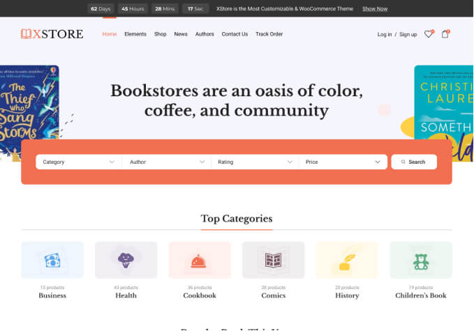
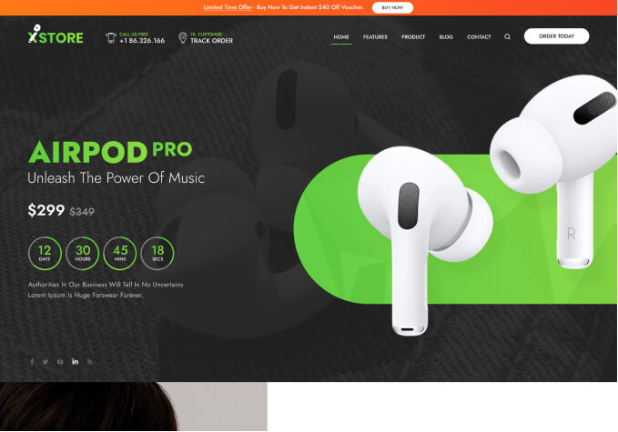
Problem with responcive (Laptop view on mobile)

This topic has 2 replies, 2 voices, and was last updated 9 months, 2 weeks ago ago by Rose Tyler

  • Avatar: Doddy
    Doddy
    Participant
    July 24, 2023 at 08:51

    Hello ! I have a “little” problem on the mobile version of my website. When i’m on my phone, I see the laptop version ! That’s not a problem with the detection of the device’s width in general because my personal css I put is fine but, it’s a problem with the theme. Bloc HTML and main menu that are displayed are ones for laptop.

    My website is lofra-france.com

    Oh ! And the problem disappear when I update my page before coming back after like 2 hours.

    1 Answer
    Avatar: Rose Tyler
    Rose Tyler
    Support staff
    July 24, 2023 at 09:11

    Hello, Doddy,

    Thank you for contacting us and for using XStore.

    We suggest that you turn off the Mobile Content Optimization option (Theme Options > General) if you are using a cache plugin for mobile devices, as both optimization options can conflict with each other.

    Kind Regards,
    8theme team

  • Viewing 2 results - 1 through 2 (of 2 total)

You must be logged in to reply to this topic.Log in/Sign up

Helpful Topics

We're using our own and third-party cookies to improve your experience and our website. Keep on browsing to accept our cookie policy.