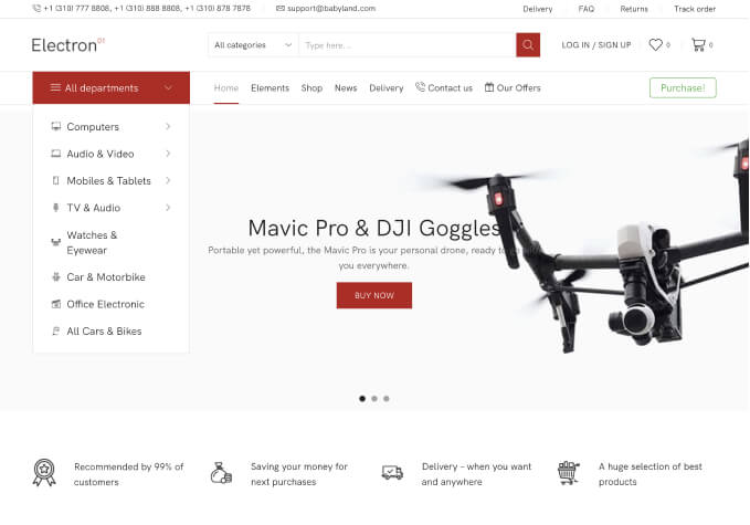
Hi,
I have recently updated to the latest wootheme update and I need to resolve the following issues, if you can list what I need to doso I can make the changes please.
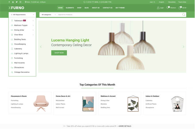
1) The seperator line does not align on the categories list (please see imaage) also look on the website, link posted in private.
2) the search box on mobile devices is not aligned, the search button and search box are too big.
3) I have noticed since the update when on a mobile such as the iPhone that the webpage moves from left to right when sliding with your finger is this a zoom issue with ios?, the previous woothemes installs did not do this?
On the previous version the page was fixed i.e. you could not move the page?
Hello,
1. Add this code in child style.css:
.sidebar .widget_product_categories {
margin-top: 30px !important;
}
2. Use this code in child style.css:
@media (max-width: 480px) {.et-search-trigger.search-dropdown form {
width: 350px !important;
}}
3. Could you please clarify with more details? How can we replicate the issue?
Regards,
Eva Kemp.
More issues with upgrading to your latest theme! ….
Visual Composer element on page, text has dropped down lower than it was before?
the gap between the title and the text below is too big!
Please see picture below;
website in private content + admin
Hello,
Use this css code to remove the gap:
.aio-icon-header + .aio-icon-description {
margin-top: 0px !important;
}
.aio-icon-component * {
margin-bottom: 2px !important;
}
Concerning the search form use this code instead of the previous one:
.et-search-trigger.search-dropdown form {
width: 250px !important;
}
.et-search-trigger.search-dropdown form .form-group.form-button .btn-black {
padding: 10px 10px !important;
font-size: 10px !important;
}
.header-search .has-border .form-control {
width: 170px;
}
Regards,
Eva Kemp.
Eva,
Re: search form works in portrait mode on iPhone but landscape search box is big and button is-aligned ?
The same applies to the iPad in portrait and landscape mode, mis-aligned.
Obviously the search box needs more media queries for the core files as standard.
Thanks
Eva, firstly please remove the image with my logo, I have advised you about posting this up before but you continue to do it!
It does not display correctly as I have checked several times, you must be checking on a desktop Eva.
Still unresolved sorry to say, can someone else take a look?
Still issues to resolve are the following
2) search form on devices (not responsive at all)
3) website not fixed moves from left to right on mobile devices (responsive issues)
* previous versions did not do this!
I am sorry to say, I can not see improvements in your update …. do I have to go back to an older versions for it to work correctly.
Not impressed at all with the on-going issues this theme gets
Restored my website back to an old theme version.
PLEASE REVISE YOUR THEME UPDATE TO FIX ISSUES AND LET ME KNOW WHEN IT IS SAFE TO USE!
Wasted majority of my evening messing about with this.
Website now works including search box, also issues of web pages not fixed to the screen resolution also resolved! … issue 3) for your information.
You must be logged in to reply to this topic.Log in/Sign up
One standard license is valid only for 1 project. Running multiple projects on a single license is a copyright violation.
The message was successfully sent
Your shopping cart is empty
Seems you did not register purchase code for WooPress WordPress Support Forum to be able to create a topic on this forum.