Need help with few minor changes - by luckyboy

This topic has 18 replies, 4 voices, and was last updated 7 years ago ago by Olga Barlow

  • Avatar: luckyboy
    luckyboy
    Participant
    April 15, 2017 at 03:48

    Hi,

    Can you please do the following minor changes:

    1. Add Black Line Under Header (Only for Mobile)

    Example Site:
    http://prnt.sc/ewn7ew

    My Site:
    http://prnt.sc/ewn7mf

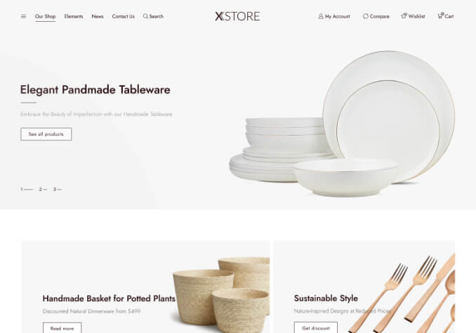
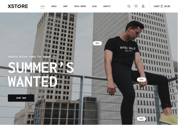
    2. I want to reduce the size / padding of Menu bar and want it like its in example site (net-a-porter). Also, Can you please add Search Bar in the Menu like it is in Example Site. I have installed Ajax Search Lite plugin on my site and its shortcode is [wpdreams_ajaxsearchlite]

    My site:
    http://prnt.sc/ewn8ro

    Example Site:
    http://prnt.sc/ewn96e

    3. Please add REGISTER link in the header just next to SIGNIN like it is in the example site.Please also change the text font color to Black for NewsLetter | SignIn | Register.

    My Site:
    http://prnt.sc/ewnbpv

    Example Site:
    http://prnt.sc/ewnc16

    Only these changes are needed and my site will be complete. Kindly, please do these as soon as you can and i will be really thankful to you guys.

    Please, contact administrator
    for this information.
    17 Answers
    Avatar: naja
    Naja Jamal
    Member
    April 15, 2017 at 06:01

    1)
    Put following code in,

    8theme options –>> styling –>> custom CSS –>> Custom CSS for tablet (768px – 991px)
    and in,
    8theme options –>> styling –>> custom CSS –>> Custom CSS for mobile landscape (481px – 767px)
    and in,
    Custom CSS for mobile (0 – 420px)

    .header.main-header { border-bottom: 5px solid; }

    Change the 5px to the amount you want

    2)
    Put following code in,

    8theme options –>> styling –>> custom CSS –>> global custom css

    .header.main-header .container .container-wrapper { padding: 0px !important; }

    Can you please add Search Bar in the Menu like it is in Example Site.
    – this is not possible

    3)
    Please add REGISTER link in the header just next to SIGNIN like it is in the example site
    – Not possible

    Please also change the text font color to Black for NewsLetter | SignIn | Register.
    – Put following code in,
    – 8theme options –>> styling –>> custom CSS –>> global custom css

    .header-wrapper.header-two-rows .top-links ul > li > a { color: #000 !important; }

    Avatar: luckyboy
    luckyboy
    Participant
    April 15, 2017 at 06:27

    Perfect, Thanks a lot Naja.

    3. is it possible to replace NewsLetter link with Register?

    .header-wrapper.header-two-rows .top-links ul > li > a { color: #000 !important; }

    the above code worked fine on desktop but on Mobile and Tablet, the font color is still WHITE.

    * Olga helped me and added this code for me:

    @media only screen and (max-width: 480px){
    .template-container .header-logo img {
    max-width: 60px !important;
    }
    .template-container .header-wrapper.header-two-rows .container-top-wrapper{
    padding: 15px 0 15px 0;
    }
    }

    it works perfect on mobile (0 – 420px). can u tell me the adjustments of above code for mobile landscape and tablet?

    Thanks once again

    Avatar: naja
    Naja Jamal
    Member
    April 15, 2017 at 09:18

    3)
    is it possible to replace NewsLetter link with Register?
    – the thing is that part can not be edited.
    – you will be needing some PHP file edits.
    – if we can replace the text there we can add another text too
    – but that is not possible by default.

    the above code worked fine on desktop but on Mobile and Tablet, the font color is still WHITE.

    put this code too in,
    8theme options –>> styling –>> custom CSS –>> global custom css

    .mobile-menu-wrapper .links li a { color: #000 !important; }

    Avatar: luckyboy
    luckyboy
    Participant
    April 15, 2017 at 23:53

    Thanks a lot Naja.

    * can you please give me css code to make the footer’s background colour BLACK. its not changing through theme’s options.

    http://prnt.sc/ewxez4

    It’s #242424 and i want #000000.

    * Can you please give me css code to make the logo center for tablet, mobile landscape and mobile.

    https://snag.gy/M16gTo.jpg

    Avatar: naja
    Naja Jamal
    Member
    April 16, 2017 at 04:53

    footer’s background colour
    – You can change footer background colour in,
    – 8theme options –>> Stylinng –>> Footer –>> Footer Background Color : http://prnt.sc/ewzhmu

    make the logo center for tablet, mobile

    – Put following code in,
    – 8theme options –>> styling –>> custom CSS –>> Custom CSS for tablet (768px – 991px)
    and in,
    – 8theme options –>> styling –>> custom CSS –>> Custom CSS for mobile landscape (481px – 767px)
    and in,
    – Custom CSS for mobile (0 – 420px)

    .et-header-full-width .header-logo { padding-left: 0; text-align: center; width: 100%; }

    Avatar: luckyboy
    luckyboy
    Participant
    April 16, 2017 at 06:16

    * i did from the settings but its not changing its color, have to change it through css code.

    Settings:
    https://snag.gy/4dMAVy.jpg

    But Color didn’t changed:
    https://snag.gy/y7Mgeh.jpg

    * The following code is only for Mobile, how can i use that for Mobile Landscape and Tablet as well?

    @media only screen and (max-width: 480px){
    .template-container .header-logo img {
    max-width: 60px !important;
    }
    .template-container .header-wrapper.header-two-rows .container-top-wrapper{
    padding: 15px 0 15px 0;
    }
    }

    Avatar: naja
    Naja Jamal
    Member
    April 16, 2017 at 12:26

    To change the footer background colour put following code in,

    8theme options –>> styling –>> custom CSS –>> global custom CSS

    .footer-bottom { background-color: #000; }

    The following code is only for Mobile, how can i use that for Mobile Landscape and Tablet as well?

    – just put the code in
    – 8theme options –>> styling –>> custom CSS –>> Custom CSS for tablet (768px – 991px)
    and in,
    – 8theme options –>> styling –>> custom CSS –>> Custom CSS for mobile landscape (481px – 767px)
    and in,
    – Custom CSS for mobile (0 – 420px)
    that will take affect in all tablets and mobiles

    Avatar: luckyboy
    luckyboy
    Participant
    April 16, 2017 at 13:20

    * footer code is not working, i checked it on chrome and its showing “et-footers-wrapper” for that area

    * i pasted the 2nd code in mobile landscape and tablet, not working as well.

    Avatar: amzy
    Amzy Leel
    Participant
    April 17, 2017 at 06:06

    I’ve updated the footer code and your footer background is now #000
    check : http://prntscr.com/exb9u0

    Avatar: luckyboy
    luckyboy
    Participant
    April 17, 2017 at 07:29

    Thank you Amzy

    1. The following code works fine on Mobile, but i tried it for Mobile Landscape and Tablet but it doesn’t work

    @media only screen and (max-width: 480px){
    .template-container .header-logo img {
    max-width: 60px !important;
    }
    .template-container .header-wrapper.header-two-rows .container-top-wrapper{
    padding: 15px 0 15px 0;
    }
    }

    2. How to remove the gap between Menu and Sub-Menu?

    http://prnt.sc/exbqoo

    Avatar: amzy
    Amzy Leel
    Participant
    April 17, 2017 at 10:00

    1. I’ll check this and get back to you.

    2. put following css in global custom css.

    .nav-sublist-dropdown {
        top: 9px !important;
    }

    9px matches perfectly to your site.. you can change it to the amount you want

    Avatar: luckyboy
    luckyboy
    Participant
    April 17, 2017 at 13:18

    1. Thanks for the code Amzy. I know the code is perfect, but i don’t know whats happening, i have added the code but unable to see its effect, i have cleared site’s cache, cleared my browser’s cache, but can’t see the change. i have also accessed the site through VPS but same problem.

    2. alright, i am waiting

    Avatar: amzy
    Amzy Leel
    Participant
    April 18, 2017 at 05:54

    1. I’ve fixed it.. please check: http://prnt.sc/expfdb
    2. we will update this once we find the issue

    Avatar: luckyboy
    luckyboy
    Participant
    April 18, 2017 at 06:12

    Thanks Alot Amzy

    I have translated my site into Arabic, when i go from English to Arabic version, it changes the header position along with links and icons in it, i don’t want that. i just want the text to be changed from English to Arabic but the links and icons should remain at their position like in English version.

    Header in English:
    http://prnt.sc/expi8l

    Header in Arabic:
    http://prnt.sc/expjb8

    Avatar: Olga Barlow
    Olga Barlow
    Support staff
    April 19, 2017 at 14:50

    Hello,

    We are sorry but it’s not possible by default keep LTR position for the RTL version. If you have CSS skills you may play around with styles and overwrite RTL styles.

    Regards

    Avatar: luckyboy
    luckyboy
    Participant
    April 19, 2017 at 15:54

    i have solved all my issues, only 1 minor issue left, please help me on this:

    For Mobile and Tablet, The code which u added for Header Padding works on for Mobile but i want the code for Mobile Landscape and Tablet as well

    ‘@media only screen and (max-width: 480px){
    .template-container .header-logo img {
    max-width: 60px !important;
    }
    .template-container .header-wrapper.header-two-rows .container-top-wrapper{
    padding: 15px 0 15px 0;
    }
    }’

    Avatar: Olga Barlow
    Olga Barlow
    Support staff
    April 20, 2017 at 08:05

    Hello,

    Then change max-width: 480px; to the max-width: 992px;

    Regards

  • Viewing 18 results - 1 through 18 (of 18 total)

You must be logged in to reply to this topic.Log in/Sign up

We're using our own and third-party cookies to improve your experience and our website. Keep on browsing to accept our cookie policy.