Navigation buttons on mobile. - by Bon - on WordPress WooCommerce support

This topic has 2 replies, 2 voices, and was last updated 5 years, 5 months ago ago by Rose Tyler

  • Avatar: Bon
    Bon
    Participant
    October 25, 2018 at 04:02

    Hi, there,

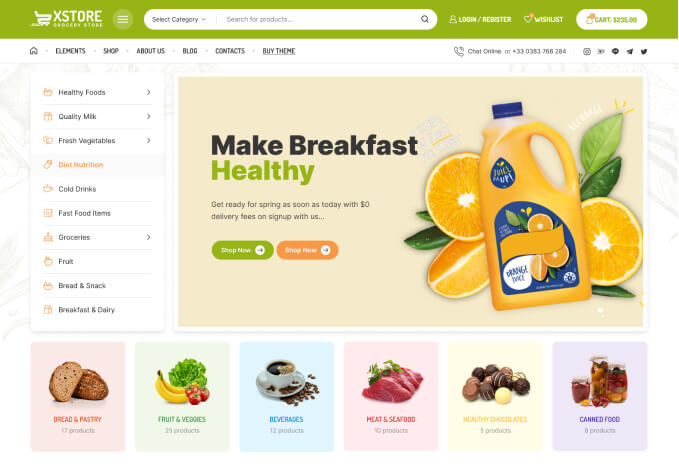
    1) How can we make the animated burgers menu on mobile version like this.
    https://xstore.8theme.com/preview-new/

    2) Can we switch the burger menu on mobile version from the right to the left side like this?
    https://xstore.8theme.com/preview-new/

    3) How can we change the burger menu icon on mobile.

    I appreciate your quick response.

    Regards

    1 Answer
    Avatar: Rose Tyler
    Rose Tyler
    Support staff
    October 26, 2018 at 07:48

    Hello,

    1. This requests additional customization which is beyond our basic support scope.
    2. Try to add this code in Theme Options > Custom css > Global custom css:

    @media screen and (max-width: 993px) {
        .navbar-toggle {
            left: auto;
            right: 0;
        }
        .navbar-header {
            right: auto;
            left: 0;
        }
        }
        .mobile-menu-wrapper {
            left: auto;
            right: 0;
            transform: translateX(300px);
        }
    }

    3. xstore/headers/(your-type-header).php
    http://prntscr.com/lam36j – navbar-toggle -> <span class="et-icon et-burger"></span>
    Make changes via child theme.

    Regards

  • Viewing 2 results - 1 through 2 (of 2 total)

You must be logged in to reply to this topic.Log in/Sign up

We're using our own and third-party cookies to improve your experience and our website. Keep on browsing to accept our cookie policy.