Mobile version of the site not showing content properly

This topic has 2 replies, 2 voices, and was last updated 5 years, 3 months ago ago by Rose Tyler

  • Avatar: MSrb
    MSrb
    Participant
    January 14, 2019 at 10:56

    Hello 8theme team,

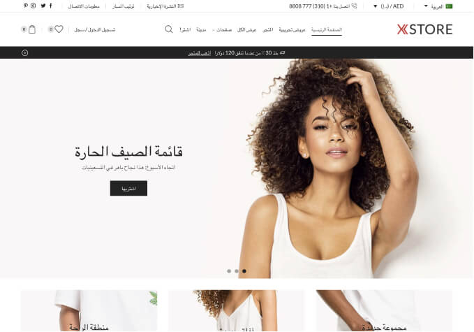
    Recently I launched my website, and the mobile version of the site isn’t showing all the content from the Home page. On the first image you can see the homepage on the desktop version, and that’s fine. Printscreen of desktop version

    On the mobile version it cuts off the heading text and the images on the right side of the website. mobile print screen
    Also on the webshop itself, the mobile version show the header first, then the widgets, and then the content.

    Additionally, the website is extremely slow to load. What can I do besides image size and format to make it load faster?

    1 Answer
    Avatar: Rose Tyler
    Rose Tyler
    Support staff
    January 14, 2019 at 13:18

    Hello,

    1/ You can change 46px font-size to 5vh
    or
    add this code in Custom css for page:

    h2.vc_custom_heading {
        word-wrap: break-word;
    }

    2/ Theme Options > Shop > Shop page Layout > Sidebar position for mobile.
    3/ Please read this topic https://www.8theme.com/topic/website-running-extreamly-slowly/

    Regards

  • Viewing 2 results - 1 through 2 (of 2 total)

You must be logged in to reply to this topic.Log in/Sign up

We're using our own and third-party cookies to improve your experience and our website. Keep on browsing to accept our cookie policy.