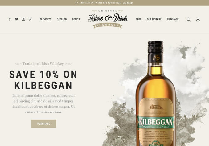
hi, I added some code in from a previous ticket to have my account etc on the top bar on mobile.
on mobile portrait looks good
on table landscape looks good
is there a way I can change it so that on mobile landscape and on ipad portrait, the top bar looks like the desktop version. e.g. the social icons are on the left of the screen and them my account links are on the right of the screen? this applies only to mobile landscape and ipad portrait. just dont think the top bar on these 2 need to be so wide as there is space.
this is the code I have at the moment.
custom css for tablet:
.template-container .top-bar .top-links {
    display: block;
    float: right;
    margin-right: 24%;
    margin-top: 5%;
}

.row-count-3 .product:nth-child(3n+1) {
    clear: none !important;
    height: 480px;
}
custom css for mobile landscape
.template-container .top-bar .top-links {
    display: block;
    float: right;
    margin-right: 22%;
    margin-top: 10%;
}

.row-count-3 .product:nth-child(2n+1) {
    clear: none !important;
    height: 430px;
}
custom css mobile
.template-container .top-bar .top-links {
display: block;
float: right;
margin-right: 5%;
}

.row-count-3 .product:nth-child(2n+1) {
    clear: none !important;
    height: 430px;
}
