I initially saw a post (link) about someone wanting 2 product column in the mobile version of their site. One of you guys recommended the following code.
@media only screen and (max-width: 480px){
.product {
  width: 50% !important;
}}
This all worked great showcasing 2 products side by side. But when you clicked into a product, it should only show on half product on the mobile screen.
But Eva Kemp recommended the following code to fix that issue:
@media only screen and (max-width: 480px){
.products-grid .product { {
width: 50% !important;
}}
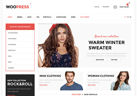
But for whatever reason, the code you recommended doesn’t seem to be working for me or the woopress theme. I would really love to have 2 products side by side, and when you actually click into the product, have that one product fill the entire screen.
Any help would be greatly appreciated.
Thank you,
Michael


