Hello,
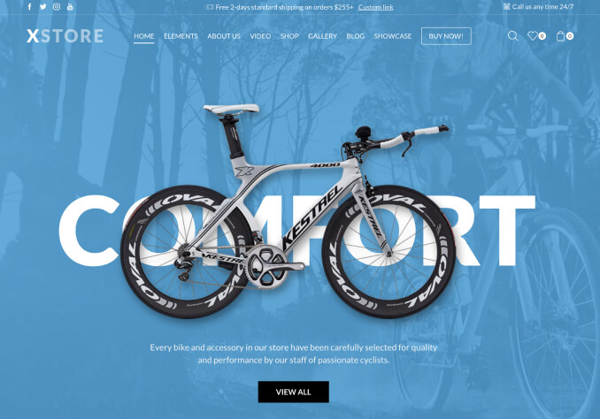
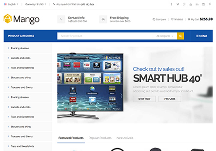
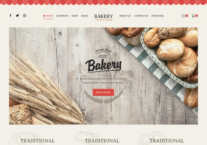
Could you please advise how to set up that background cover picture in row is scaled to mobile so it is displayed full(see url picture 1) and not just part of it(see url picture 2)? Not sure if this is even possible. Rose advised me to create 3 columns but yeah it looks ok on desktop but on mobile it is same result as before. I have enabled and looked also to WPBakery Responsive CSS Box-Module as Rose advised but, while i see options for various devices, I can’t see there would be option for background image per column for example.
Before we had slider in this place and that slider scaled and display full picture on mobile but I would like change to image only as slider was slow.
I share also login details to WP if needed.