For correction in mobile menu : screenshot – https://prnt.sc/ymai1y
1. How to reduce gap between logo & menu
2. How to increase the size of menu icon
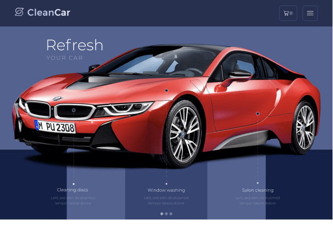
3. On the Home Page below “Slider Revolution” Currently the single image of category is showing & scroll left or right option .. I want to display thumbmail of Categories on single screen ( no left or right scroll)
Site URL: hidden Theme version: 7.2.2.1 WooCommerce version: 4.9.2Hello,
1) Theme Options > Header builder > add Connection block and more the logo and Menu inside this block.
2) Theme Options > Header builder > Mobile menu > Icon Zoom (Proportion)
3) Your question is a bit unclear for me. Please provide some screenshots for a better understanding.
Thanks in advance.
Regards
Still not able to resize icon and reduce gap (Point 1 & Point 2).
For Point 3 (Screenshot) – https://gyazo.com/934cdf12a77b5e8e0f831965b6791c40
I want category visible like this (same as website) – https://prnt.sc/youost
Incorrectly – But it is showing one image then left or right scrollbar which i don’t want like that – https://prnt.sc/youywt
Correct user id and password in private area
Hello,
1) Move the Logo element and menu to Connection block https://prnt.sc/ypz5sx
2) Use mobile header zoom option https://prnt.sc/ypzf54 + element zoom option https://prnt.sc/ypzhud
3) In this case use columns layout and move banners inside https://prnt.sc/yq0318 instead of the Custom carousel element with banners.
Regards
Mobile Menu is not showing all the things – https://prnt.sc/yunibu
All the user id and password with you
Hello,
What things are missing? Explain in more detail.
Because you should the mobile header on the screenshot, not the mobile menu content.
Regards
I wants like this all the category menu – https://prnt.sc/z8h3g6
Point 3 : I am not able to understand the process. Please do it
Hello,
Do you want to show the images in the mobile menu instead of the links https://prnt.sc/z8y92a or what?
3) I have already placed the banners to columns instead of the slider. If you want to show few columns per row on mobile instead of the 1 column per row use WPBakery Responsive options https://kb.wpbakery.com/docs/learning-more/responsive-settings/
Regards
how can i change the categories views from one image per row to 2 product per row.
Give me setting path
Hello,
Use column responsive settings https://prnt.sc/103xkwi
I have made the first row as an example.
Regards
What is the meaning of column 6/2 …
Please see the screenshot as it is not showing on all options – https://prnt.sc/104u5ce
One More thing – on sale pop up
I want Indian flag only
Hello,
1) Check the screenshot from Olga one more time. You need to select https://prnt.sc/105gmnw
2) Edit Locations description of Fake Sale Popup
Regards
2) Edit Locations description of Fake Sale Popup – How to show flag setting
it is look like this – https://prnt.sc/10b221t
Hello,
Go to Theme Options > Speed optimization > enable Emoji.
Regards
Still not displaying flag : https://prnt.sc/10bdgzh
Hello,
I check the real site instead of the preview and it’s ok.
Regards
You must be logged in to reply to this topic.Log in/Sign up
One standard license is valid only for 1 project. Running multiple projects on a single license is a copyright violation.
The message was successfully sent
Your shopping cart is empty
You may extend support period on ThemeForest and then update its status by clicking "Update" button in your Account area.
Purchase code | Expiration date |
---|---|
adb2cf8c-15ed-4d7a-a406-790658a81a6c | 03 Dec 2019 |