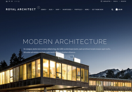
The menu ribbon for some reason is disappearing between 993-1025px before 993 you can see the ribbon then after 1025 you can see the desktop view with buttons.
How can we resolve this
This topic has 12 replies, 5 voices, and was last updated 4 weeks ago ago by
The issue related to '‘menu ribbon dissapearing in tablet portrait view’' has been successfully resolved, and the topic is now closed for further responses