Hello,
I am having issues with this theme.
I installed it on a copy of an existing website. When it comes to setting up the menu, I want the dropdowns to have columns, but even with a single column, the menu is pulling in the description of the page too?? I will put the link in the private content.
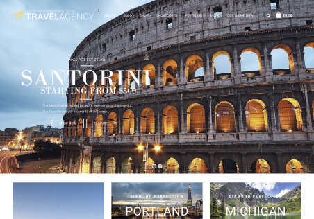
Also on the homepage, the three boxes under the main banner have disappeared, despite the code on the page being unchanged?
I have the theme installed on a second dev area and the three boxes are there, I copied the page code from there to the other site and the boxes still wont appear?
Theme version: 2.9 WooCommerce version: 4.7.3Hello,
Please read our documentation about menu https://8theme.com/demo/docs/royal/index.html#!/primary_menu
Also, add this code in Theme Options > Custom css:
.menu-item-descr {
display: none;
}
Please provide wp-admin access in Private Content to check banners.
Regards,
Rose Tyler.
Hello,
Did you upload background-image for three boxes http://prntscr.com/en3cn6? I need your wp-admin credentials to check this issue.
Please go to Theme Options > E-Commerce > Single Product Page > Enable slider for gallery images > On.
Regards,
Rose Tyler.
Thank you for your reply.
If you visit this website on an ipad, in portrait view it loads the mobile menu (side). If you turn the screen to it is landscape view, it loads the normal menu along the top, which is a problem as we have a menu item called SHOP that drops down to show all the subcategories, but it wont work on ipad.
How do we show the mobile menu (side) on both?
Hello,
You’re welcome!
Mobile menu starts from 992px. If you want to change this breakpoint it requires a lot of additional style customization.
I’ve forwarded this menu issue to our developer team to fix it.
You can try to add this code in Global Custom CSS:
@media (min-width: 992px) and (max-width: 1199px) {
.nav-sublist-dropdown {
right: -730px !important;
}
}
Regards,
Rose Tyler.
Thanks for your reply. This code doesnt work, I have altered the numbers but nothing changes.
This is definitely a problem as I have seen a number of people asking the same thing on Envato.
When can this be fixed? As we are waiting to put the site live..
Hello,
Please change previous code to:
@media (min-width: 992px) and (max-width: 1199px) {
.menu .menu-full-width .nav-sublist-dropdown ul > li {
width: 120px;
}
.menu-column5.with-image .nav-sublist-dropdown {
width: 890px !important;
}
}
Regards,
Rose Tyler.
Hello,
Yes, this code help to display the menu as in screenshot http://prntscr.com/enuob5, because change menu to mobile there requires a lot of additional style customization.
Regards,
Rose Tyler.
Hello,
The same situation you can see on our demo, dropdown menu work when user hovered element of the main menu. On devices user need to hold finger on the menu item and the dropdown nemu will appear.
The additional customization is out of our support scope.
Regards,
Rose Tyler.
You must be logged in to reply to this topic.Log in/Sign up
One standard license is valid only for 1 project. Running multiple projects on a single license is a copyright violation.
The message was successfully sent
Your shopping cart is empty
You may extend support period on ThemeForest and then update its status by clicking "Update" button in your Account area.
Purchase code | Expiration date |
---|---|
d7ed5d03-cb21-4657-b20c-442972d0523c | 15 Nov 2016 |